
Client: Raffles Health
Job Scope: Packaging Identity
Raffles Health sells most of their products on Raffles Hospital Pharmacies. Ranging from vitamins to female health pills, they struggle with keeping their wide variety of products consistent.
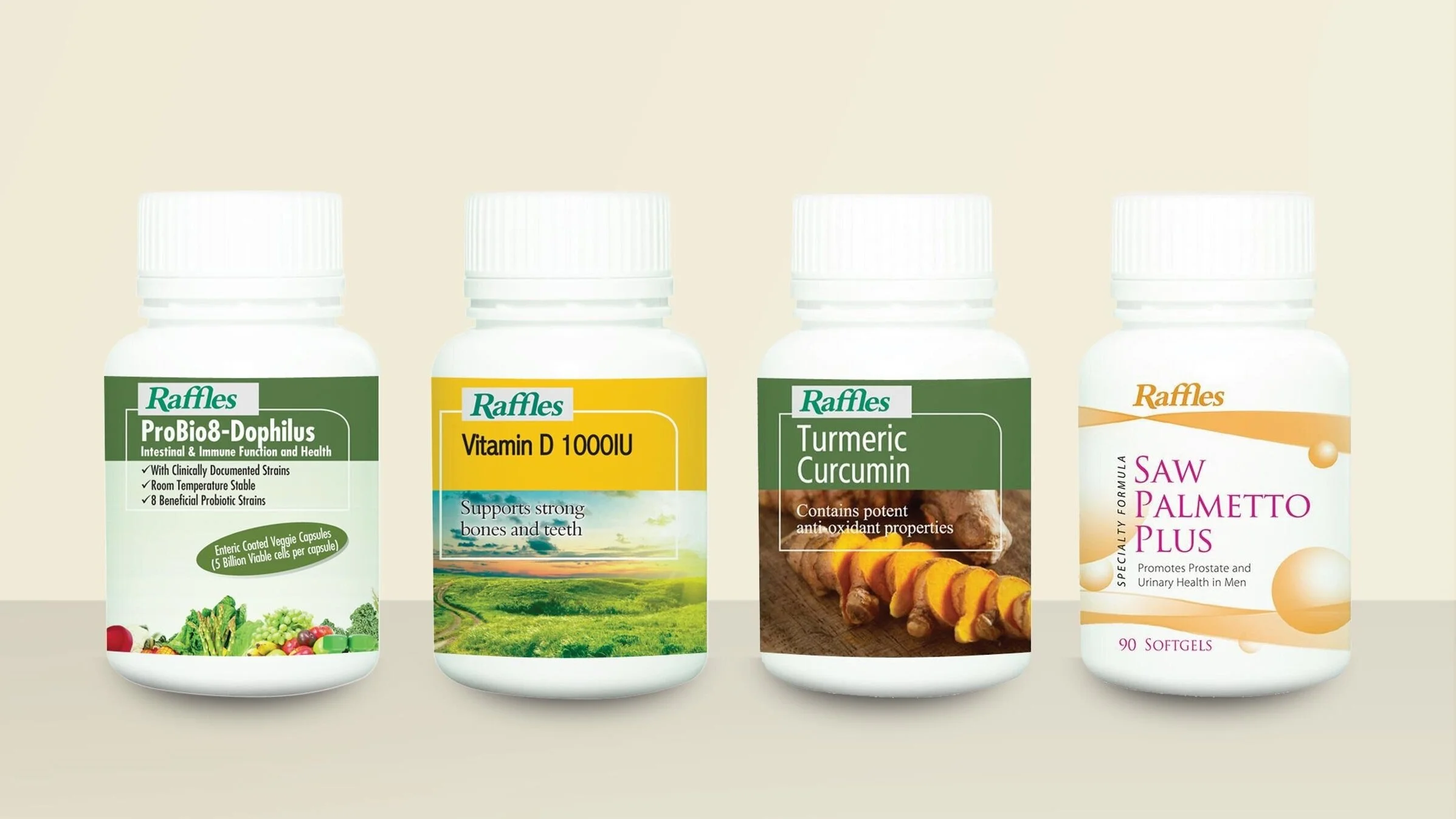
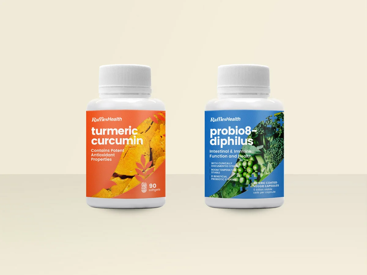
Previous Raffles Health Packaging
There are currently 5 pill categories but there was no design structure to differentiate between them.
Pill benefits are lost against the image background. Bringing the pill benefits upfront will strengthen consumer’s trust and confidence in the product.
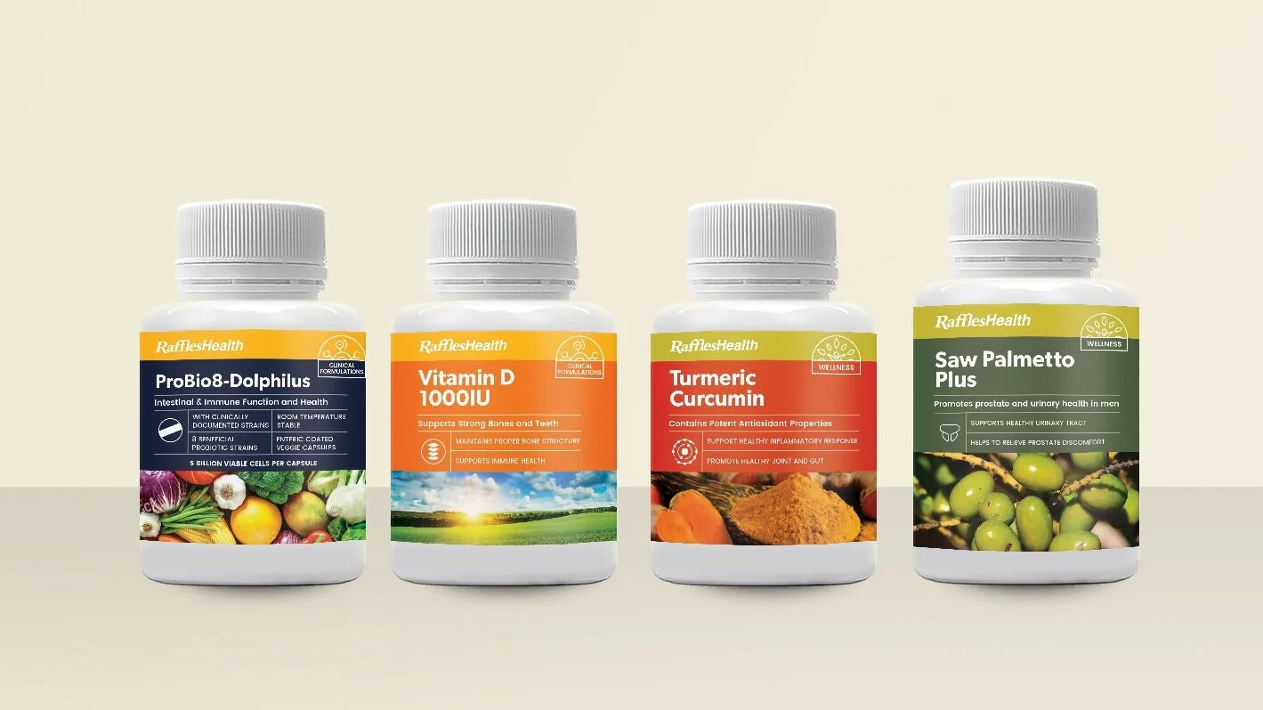
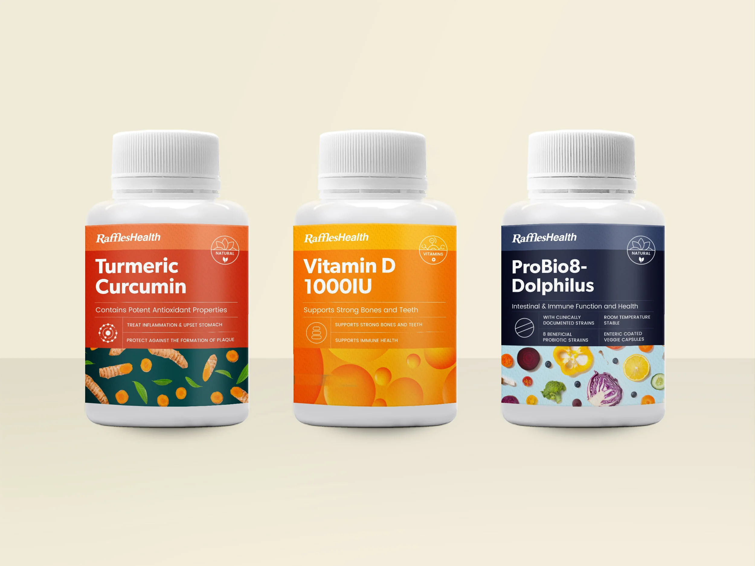
Design 1 (Selected by Client)
Raffles Health maintains an air of classiness with it’s strict grid and muted colours. Pill benefits are emphasised with an abstract icon and lines to ensure the health-concious consumer can sift through and find what they need.
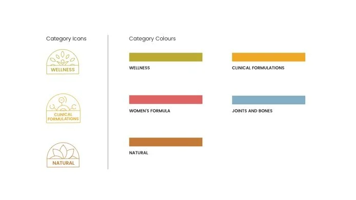
Each product category has a lockup and an assigned colour for easy recognition.
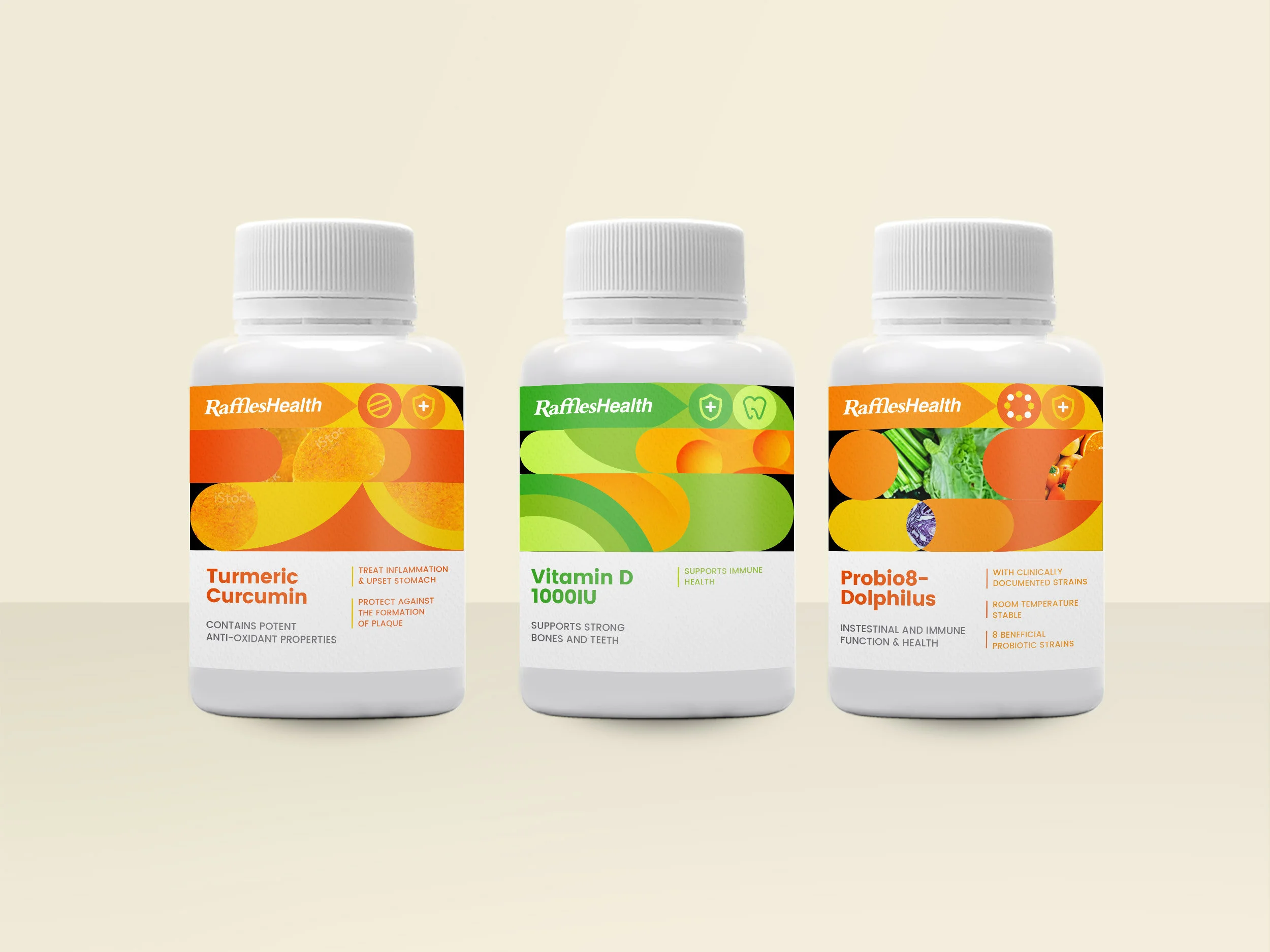
Label Proposals
Design 2
Exploring a younger approach, this design relies in the image lockup to convey the different product categories.
Design 3
Arranging etched ingredient images as a pattern for a fresh design.
Design 4
Mixing simple vector shapes with pill ingredients images to give it a contemporary look. The logo and benefit icons lockup is nestled within the colourful shapes