Beauty meets Science.
CLEAR CALENDULA KEY VISUAL
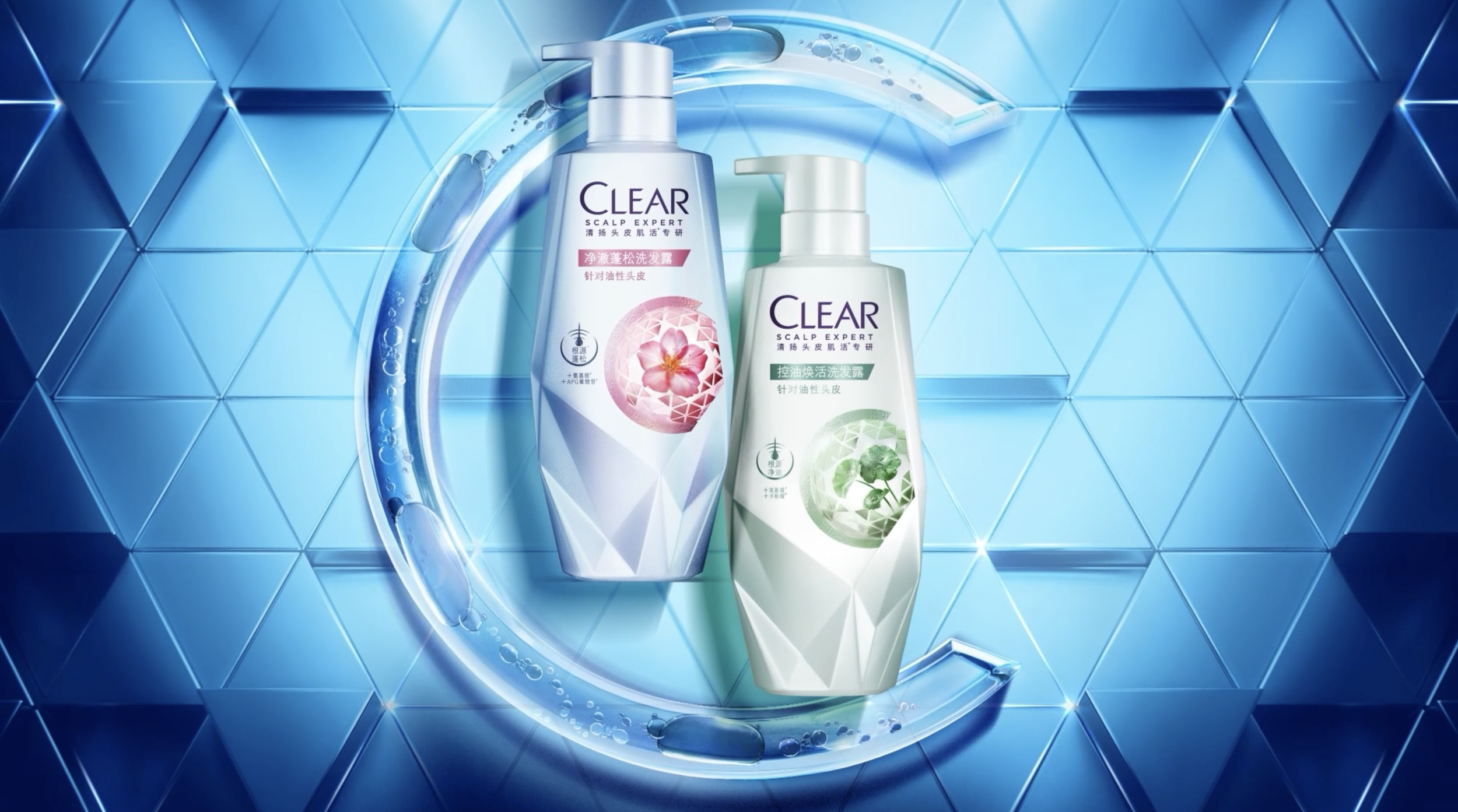
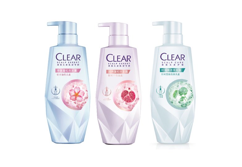
In the midst of upgrading the brand world of Clear, we were tasked with creating the key visual for Clear’s Premium Women’s bottle in China.
THE BRIEF
Land premium skin/ scalp beautification. Build up scalp expertise image, science codes. Differentiated with core range
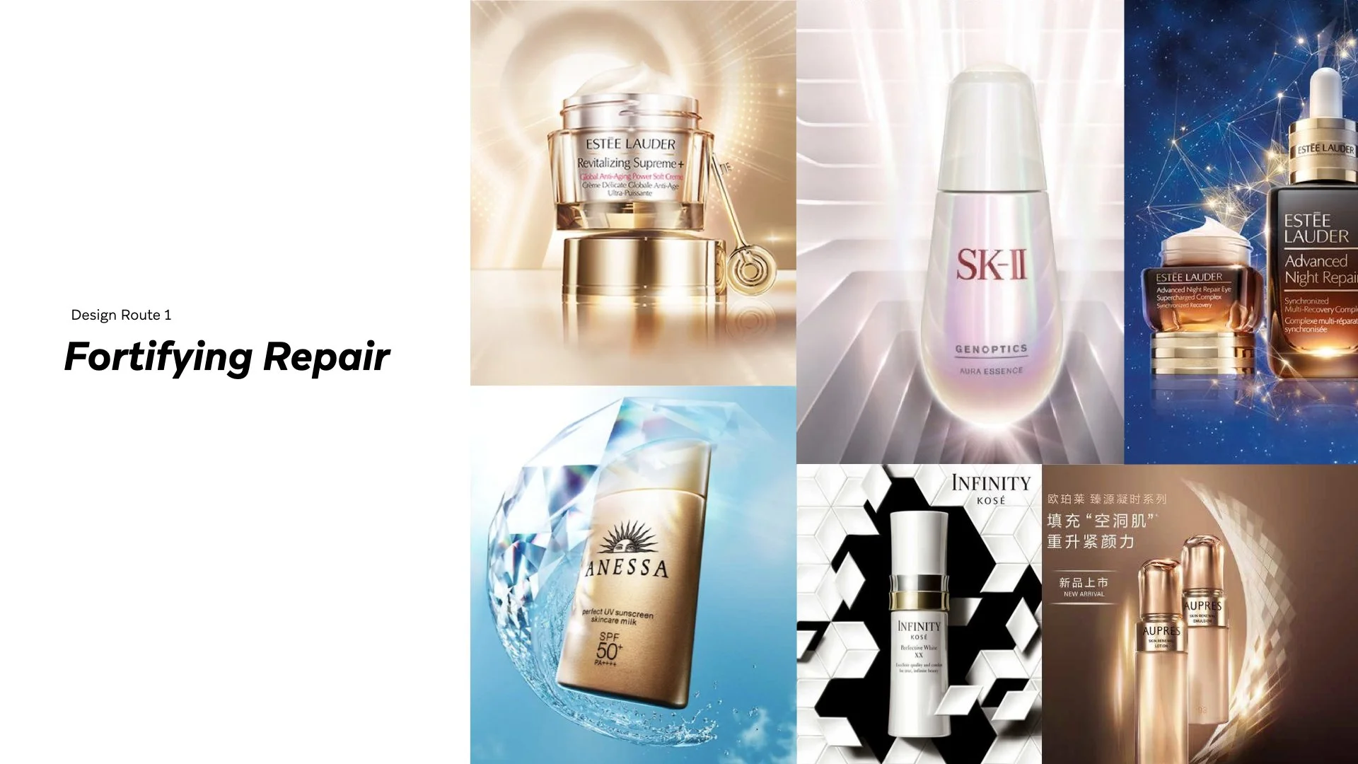
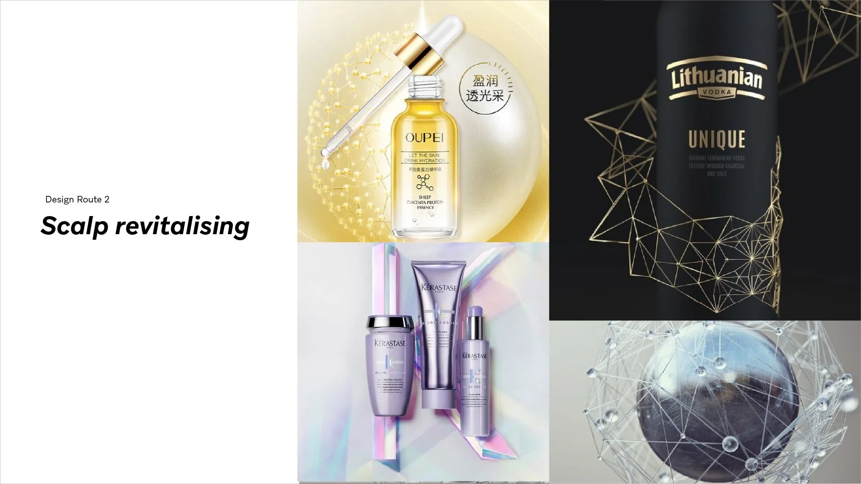
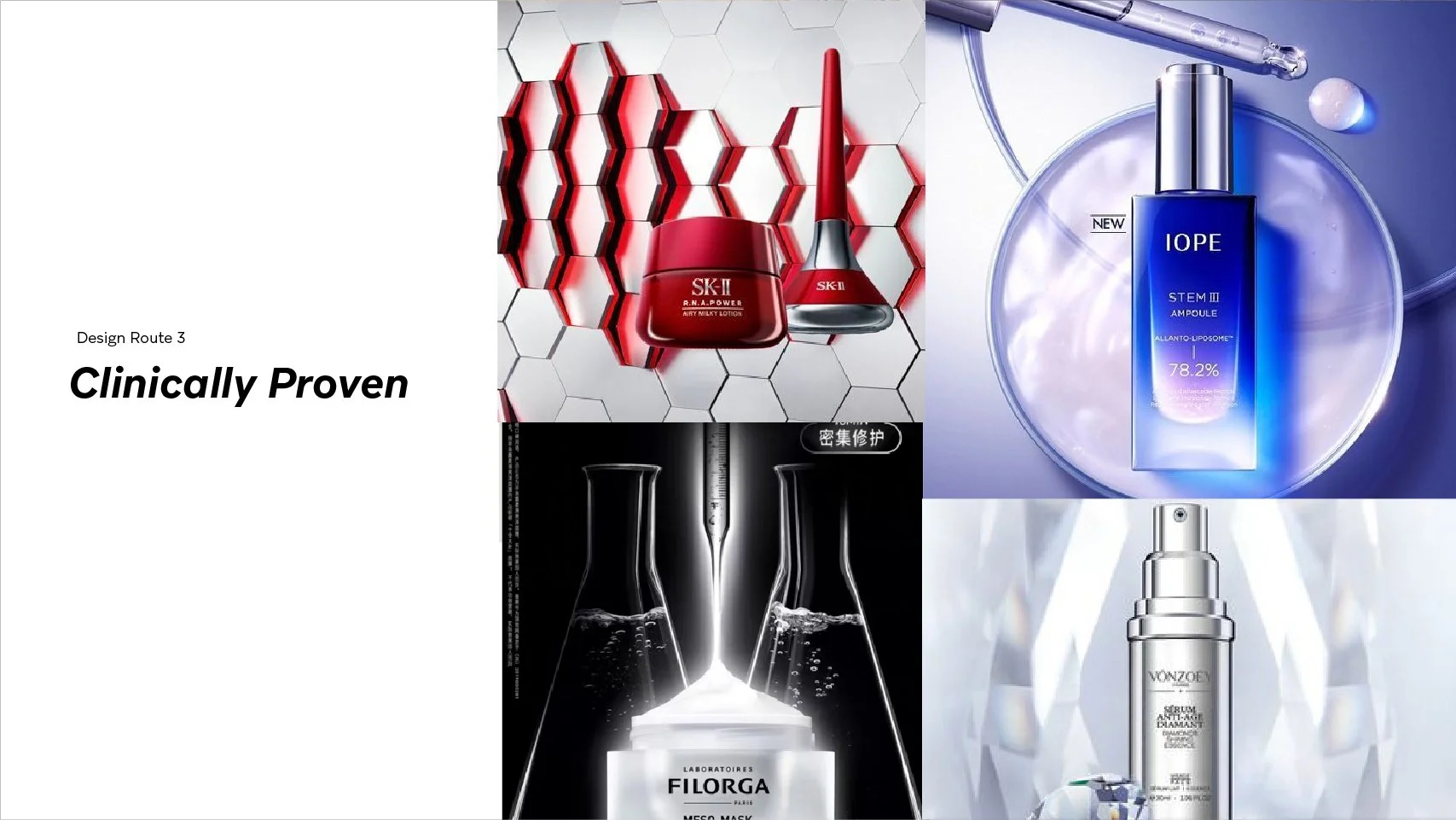
KEY LEARNINGS FROM PREMIUM WOMEN
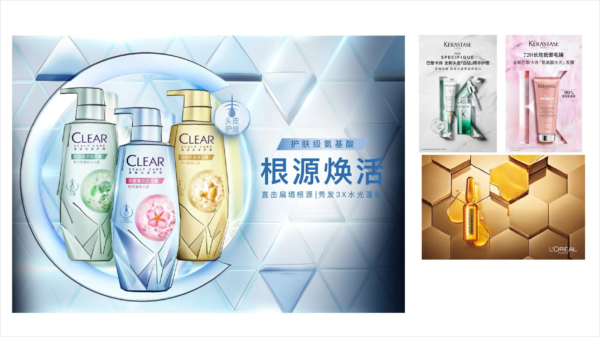
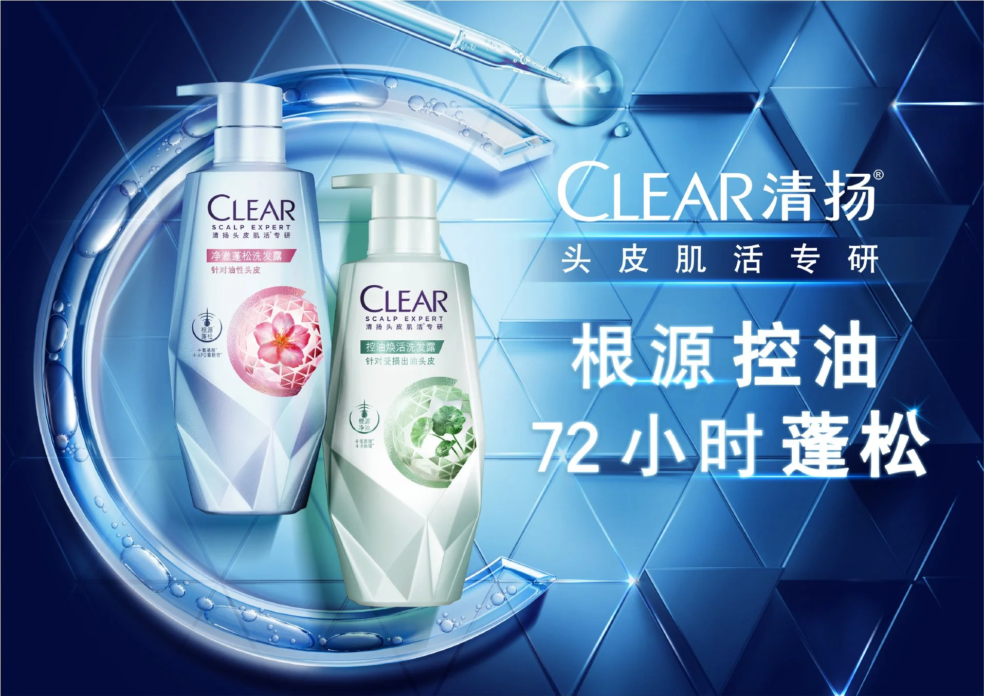
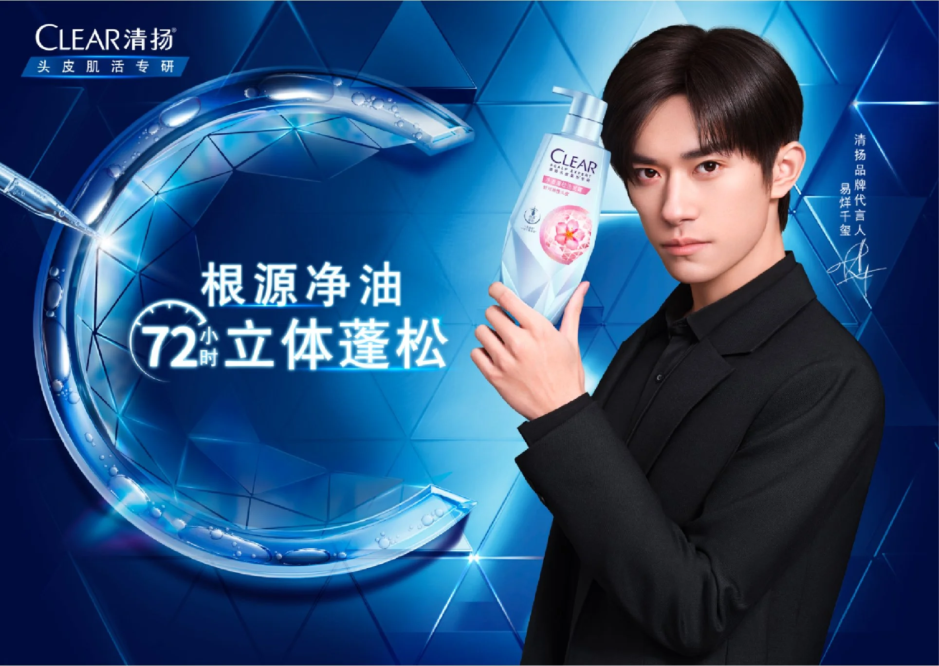
Injecting skincare into overall visual language through colours, and ingredient visualisation.
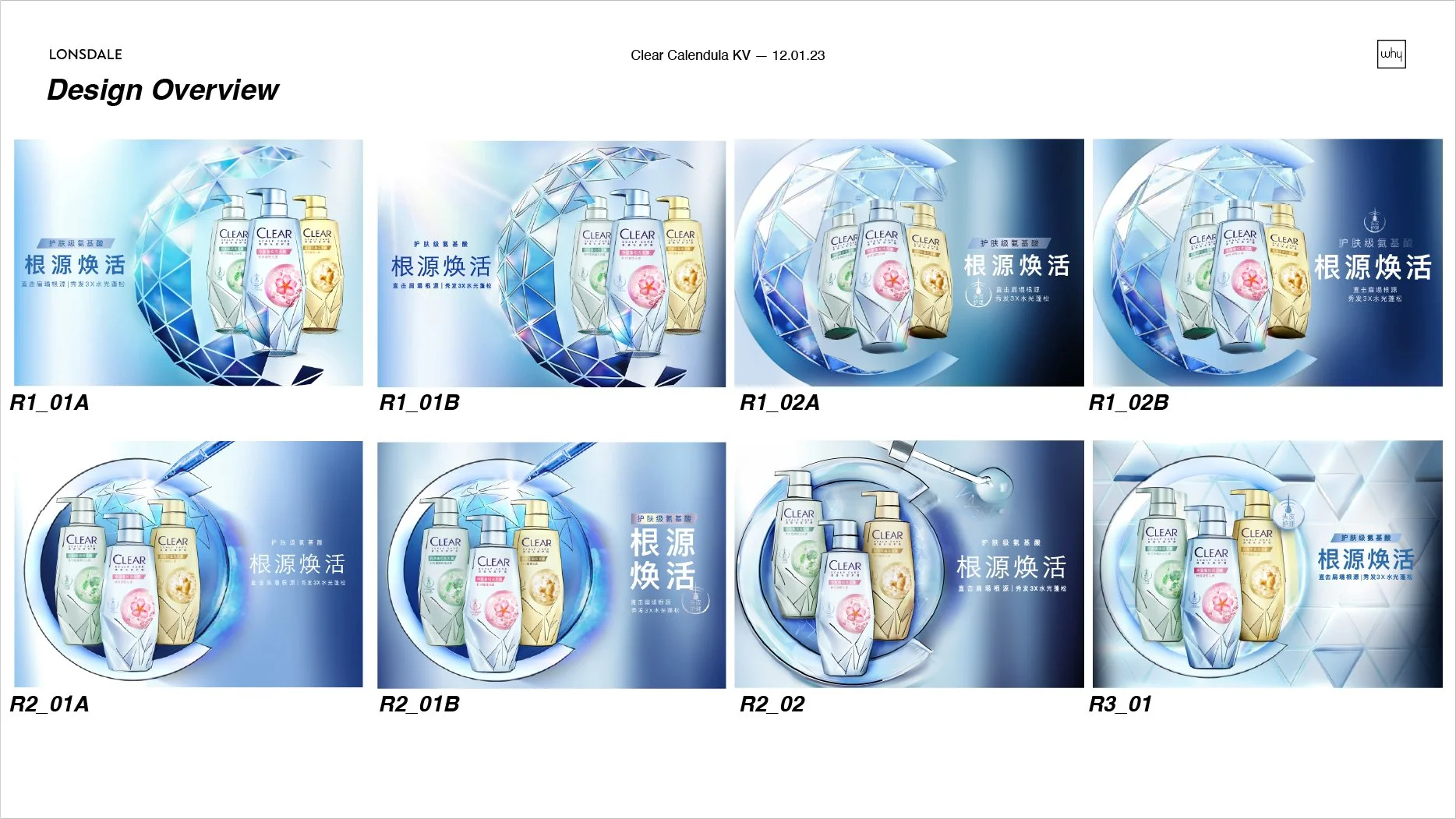
Pack elements to suggest minimal and single minded visual to land premiumness.
Pastel colour palette is the trend from premium skincare.
Structures like hexagon & geometric sphere are often used for revitalising repair. Differentiate on pack KV and range KV yet looking as same family
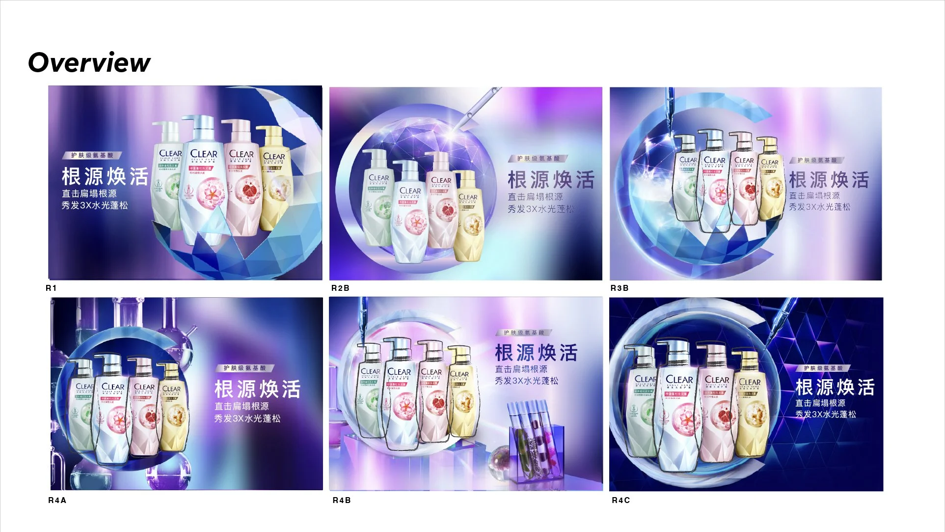
CREATIVE DIRECTIONS