
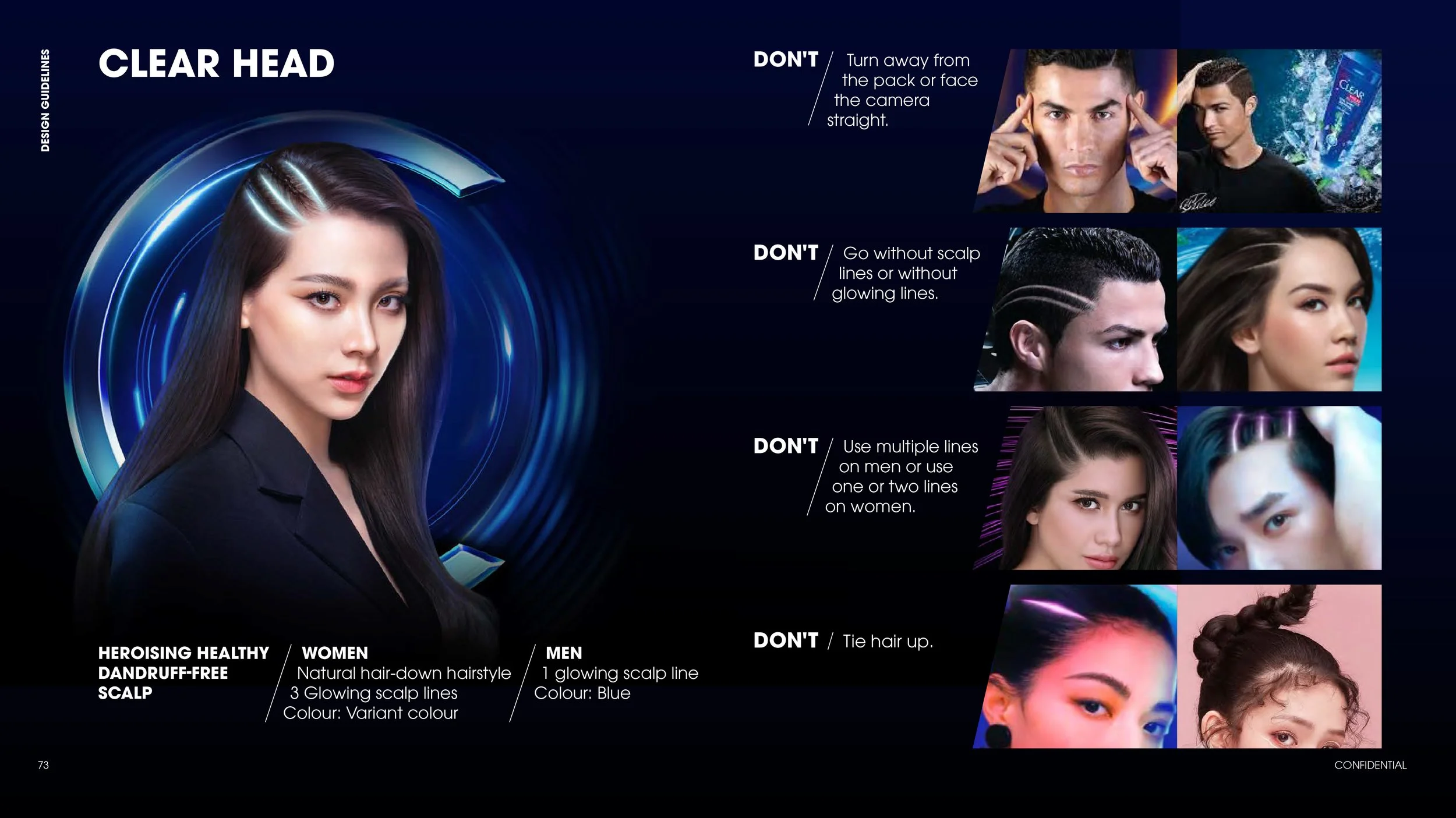
A clear head, free of returning scalp problems and associated anxiety, can boost your confidence to perform at any moment.
CLEAR BRAND BOOK
Creative Director: Bambang
Designers: Aerielle, Audrey, Rachel
Clear is the 1st Anti-Dandruff shampoo to conquer recurring dandruff from the root to the scalp. Clear wants to transform their portfolio from anti-dandruff superiority, to Scalp Expert.
WHO IS CLEAR?
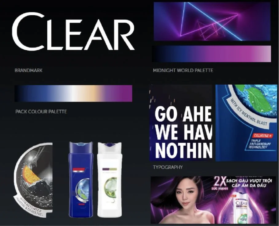
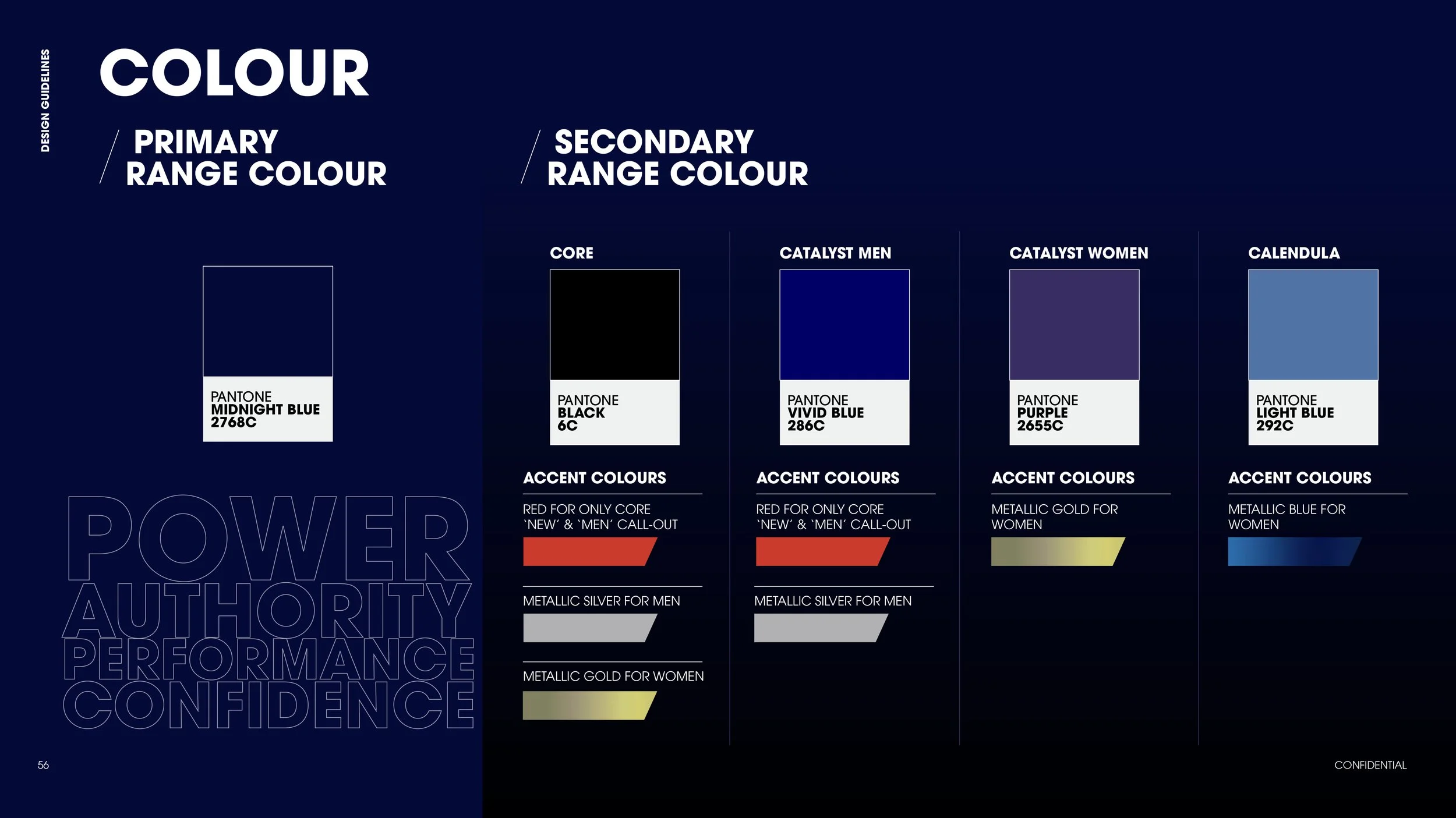
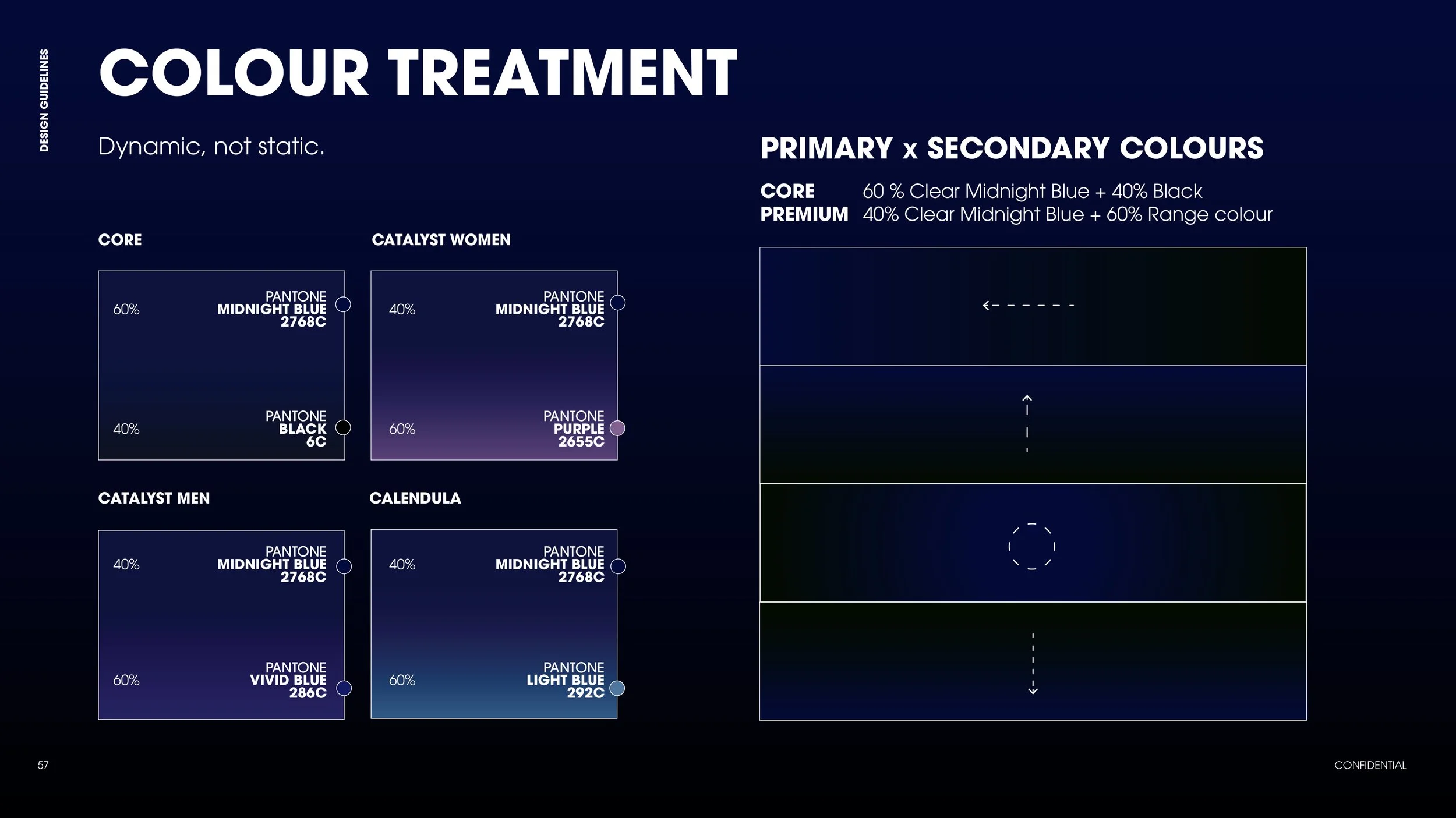
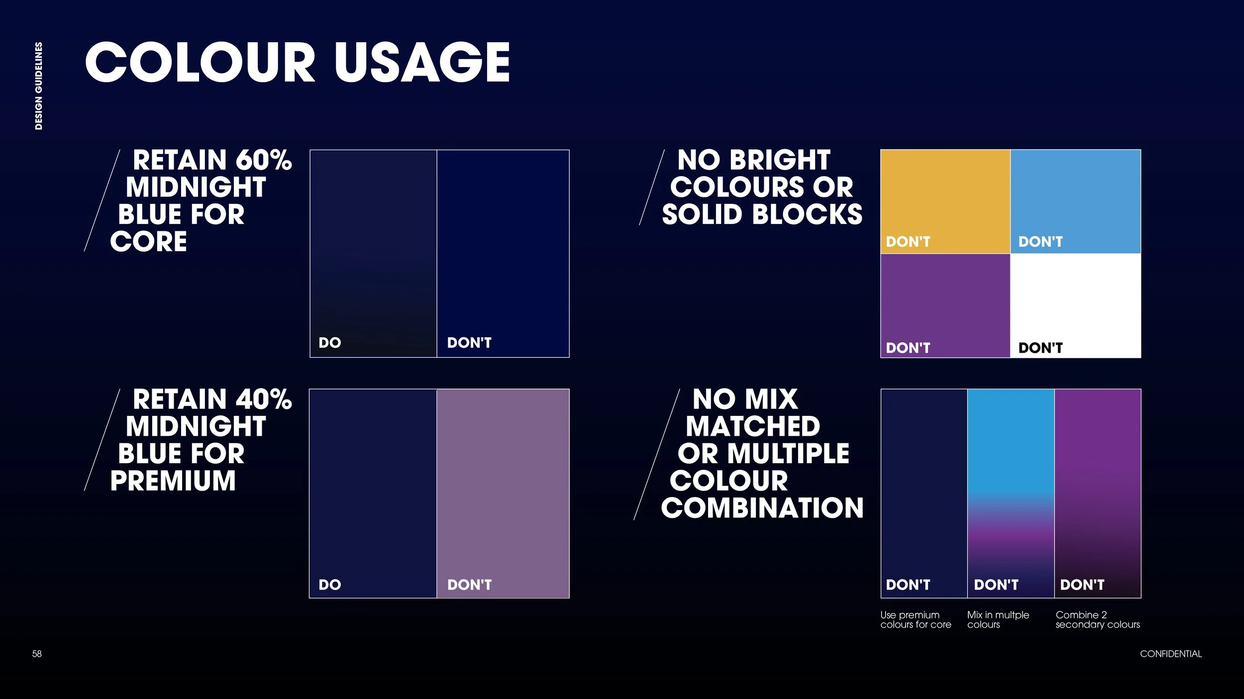
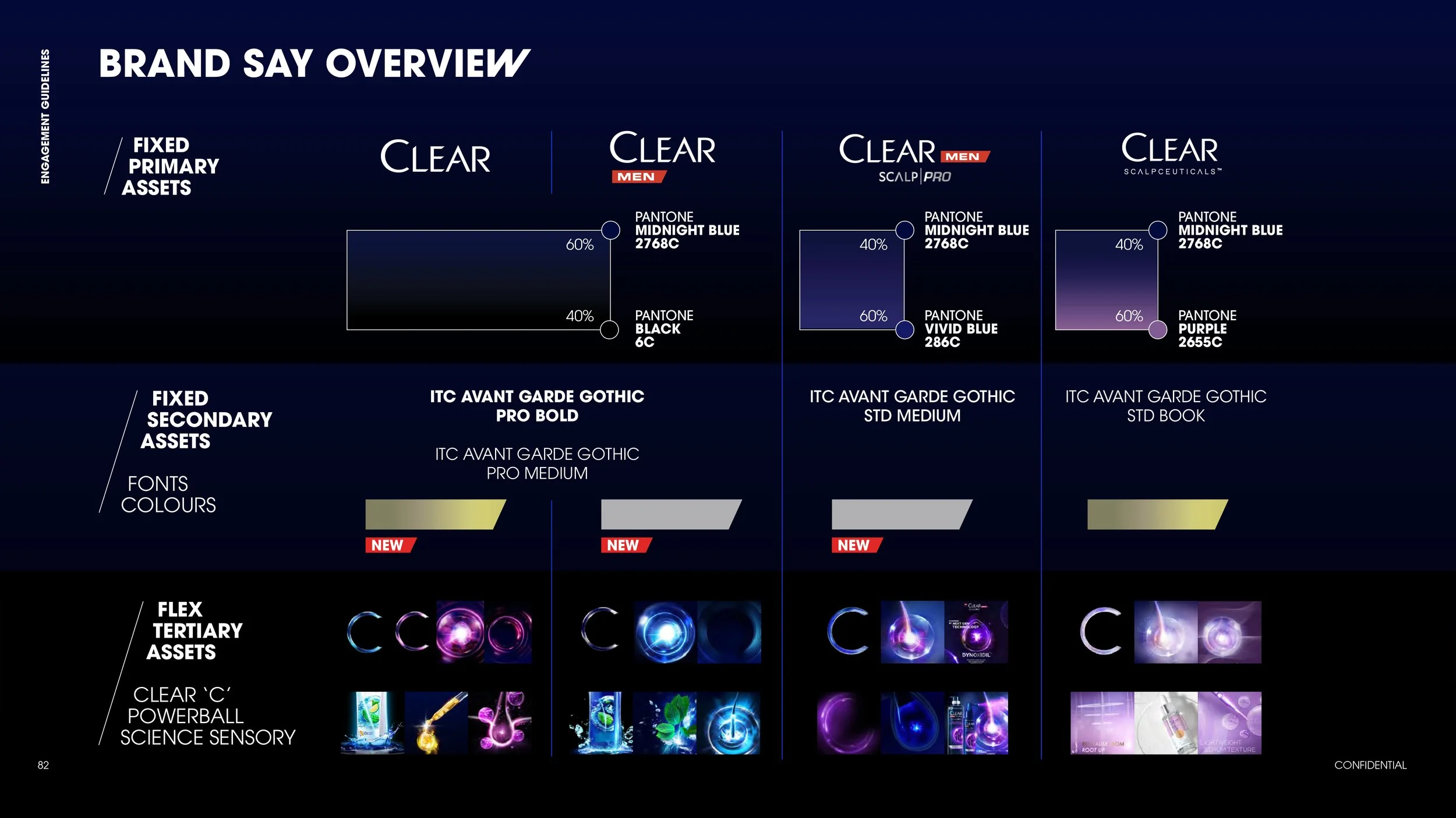
COLOUR
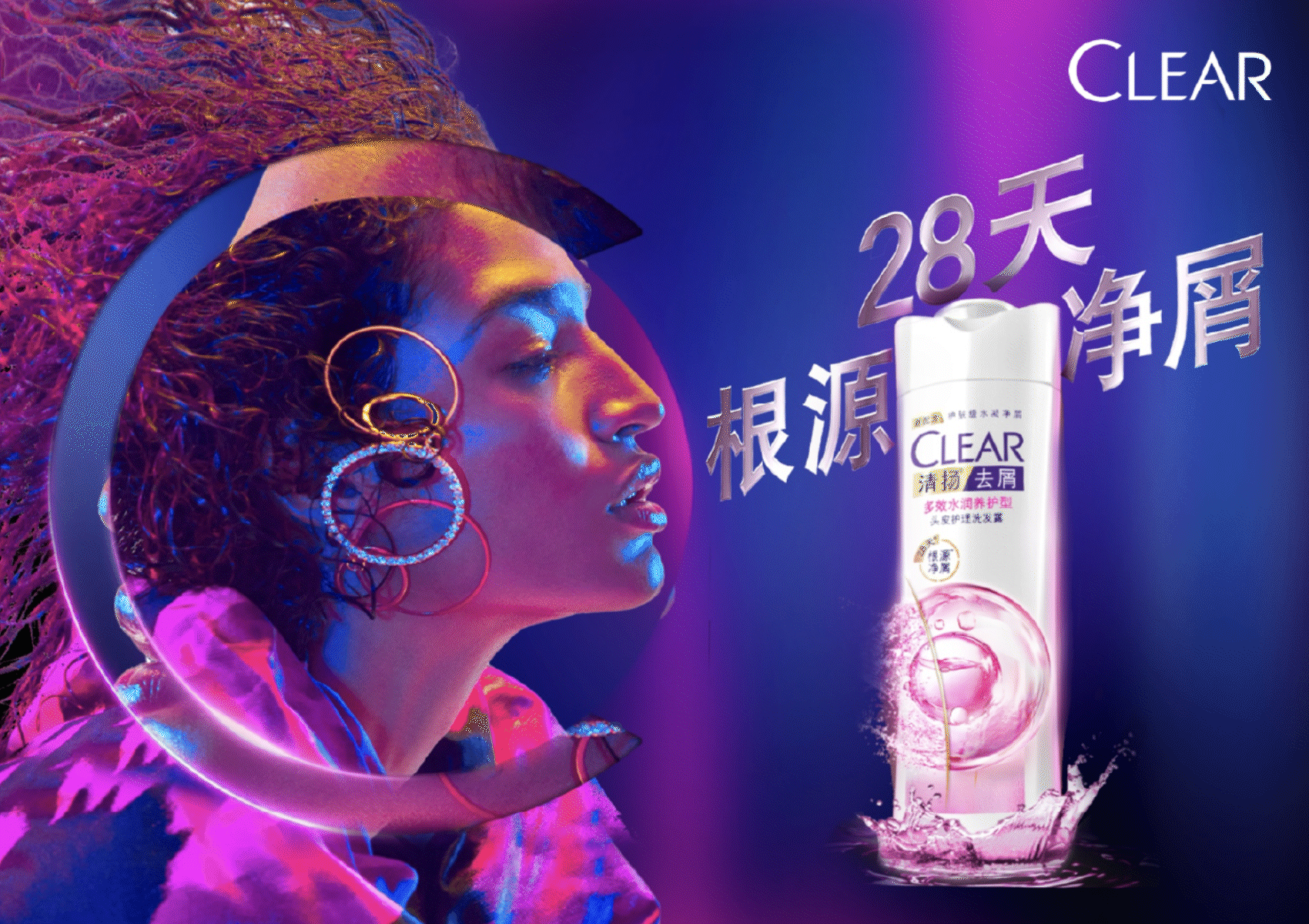
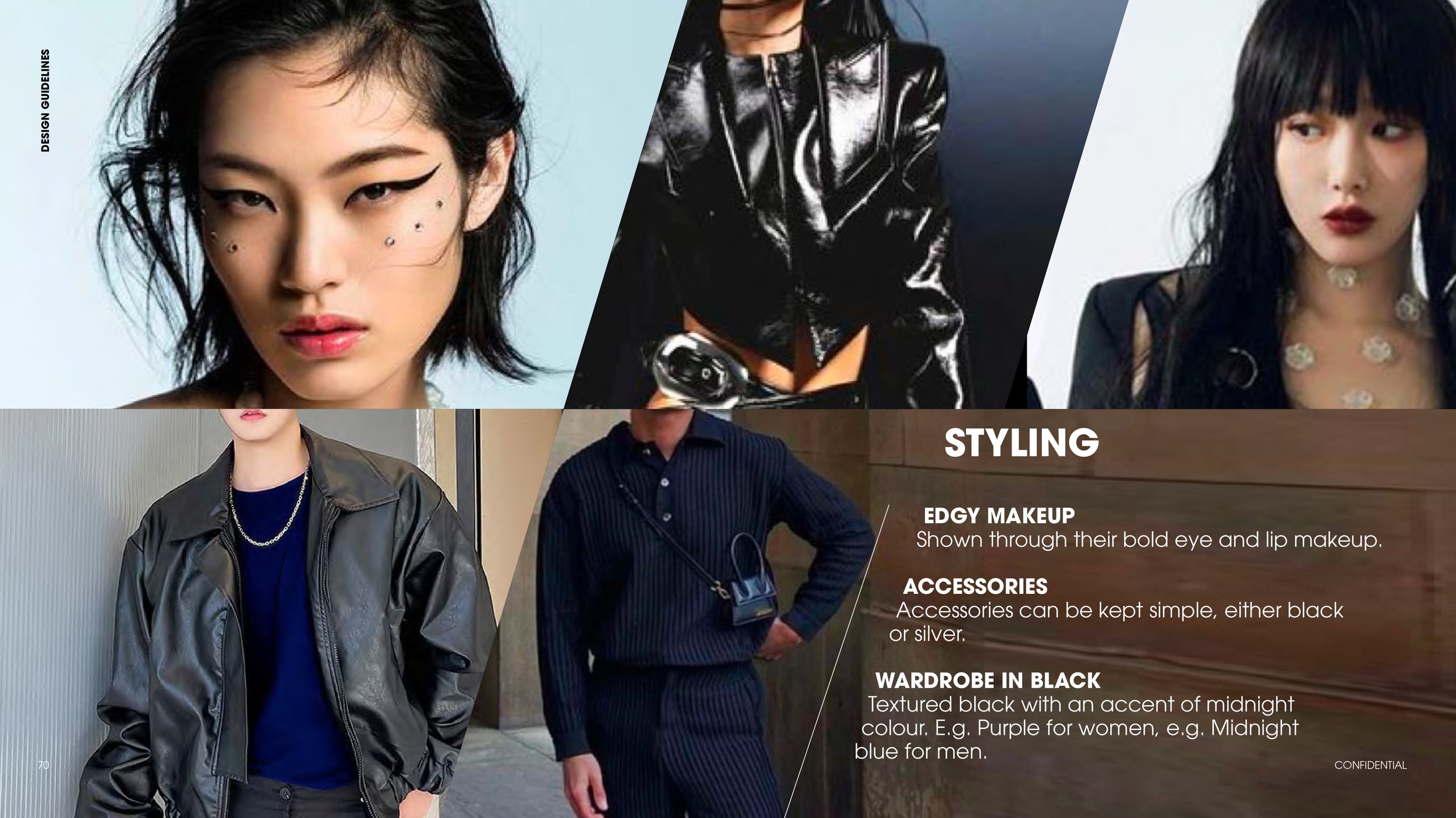
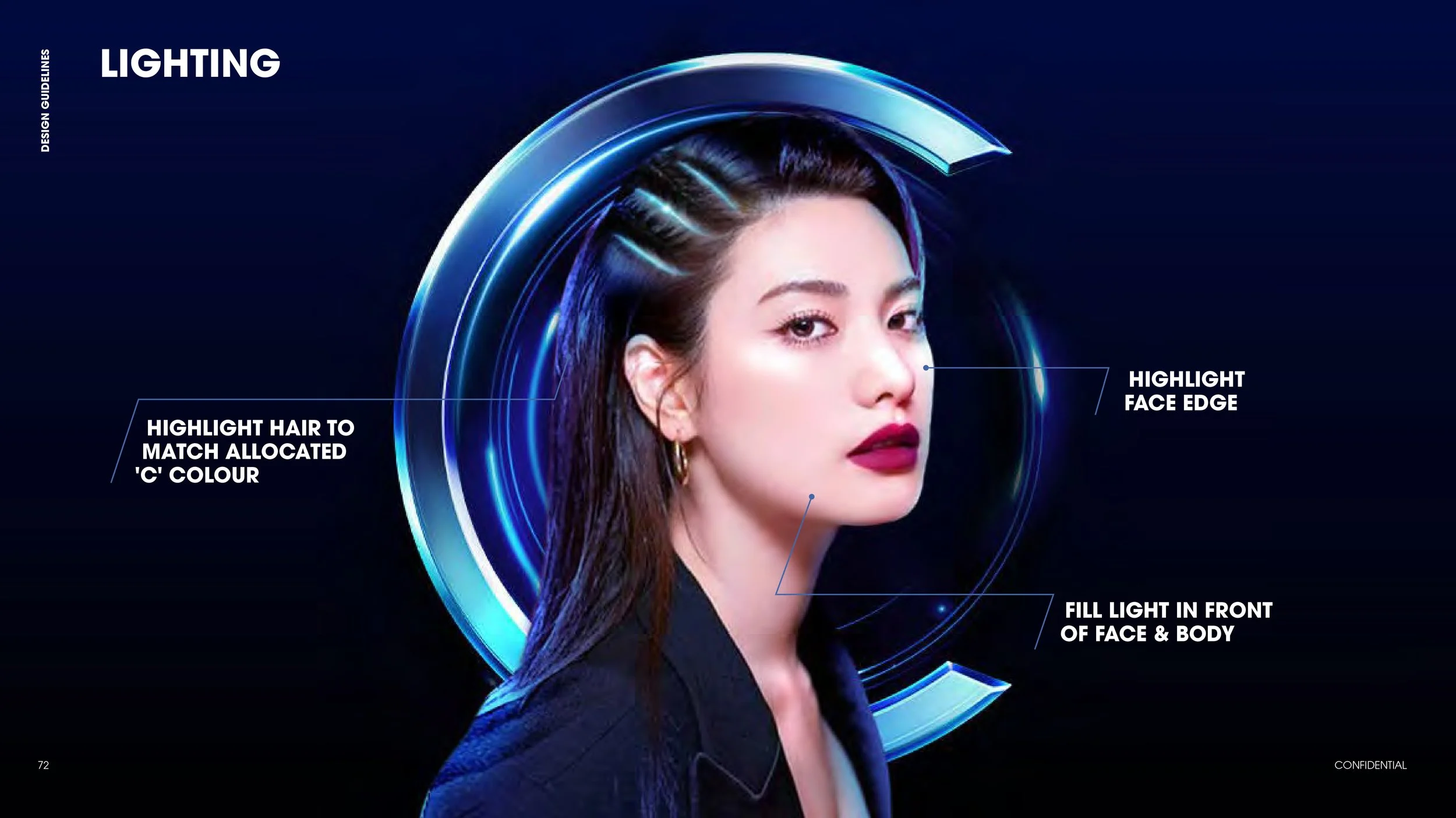
Midnight world palette, black dominates most of the communications, to highlight the confidence of a dandruff-free scalp. Neon lights stand out against their dark world, exuding confidence & edginess
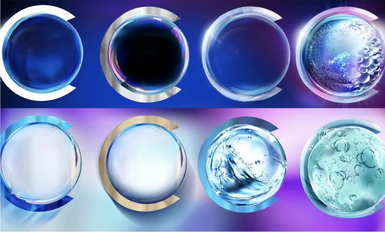
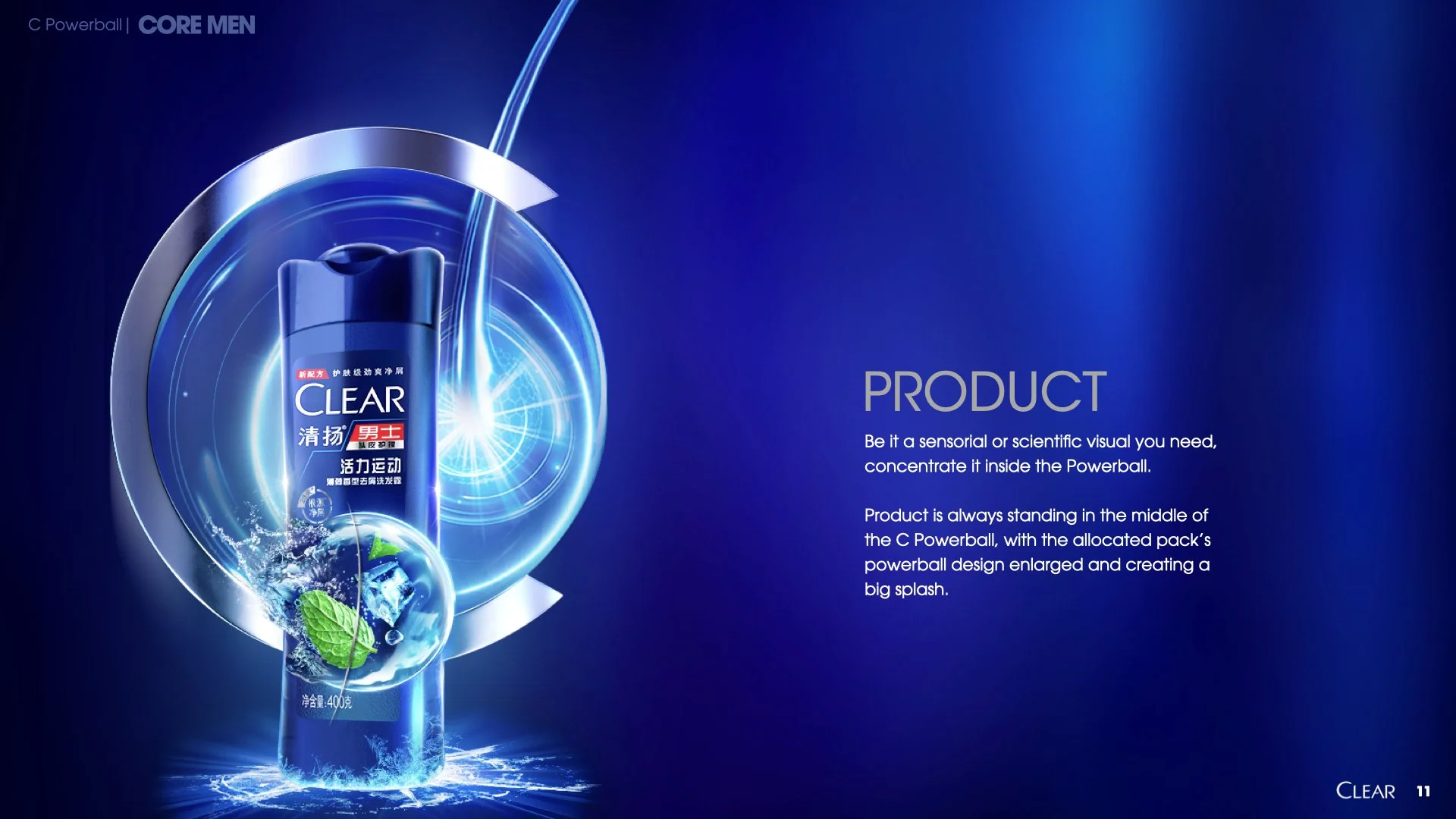
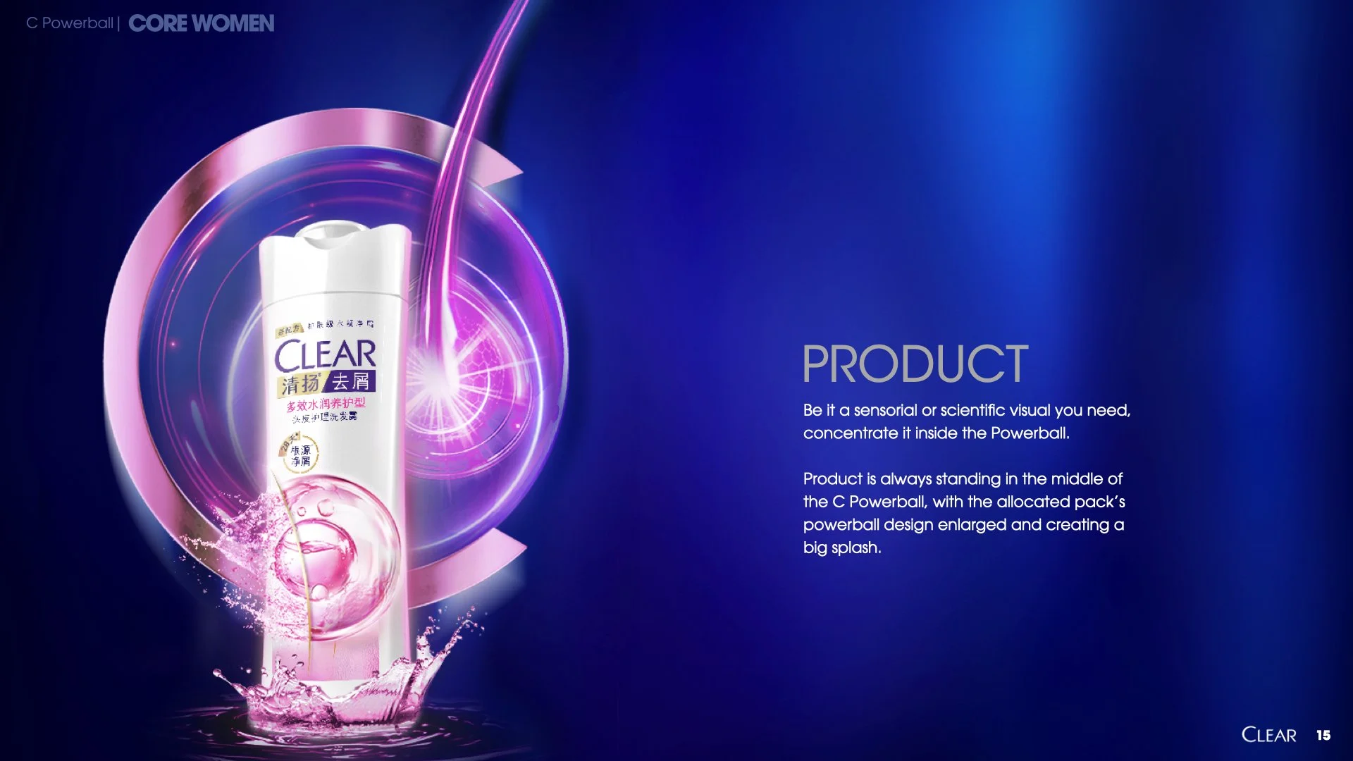
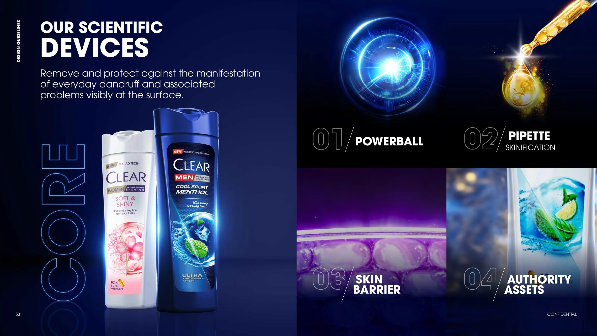
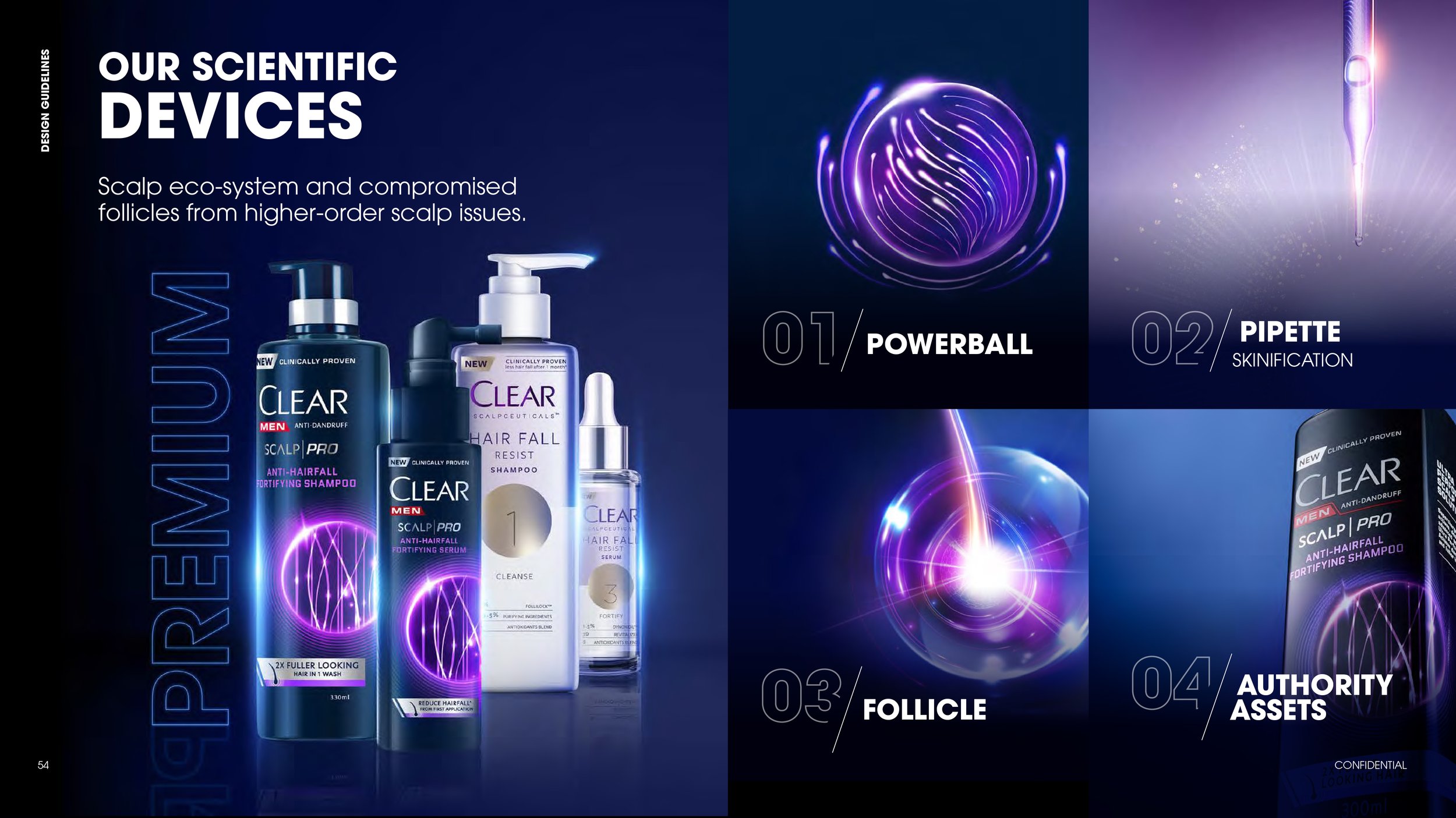
POWERBALL
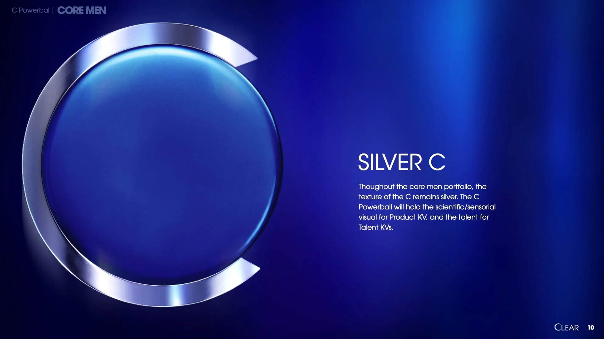
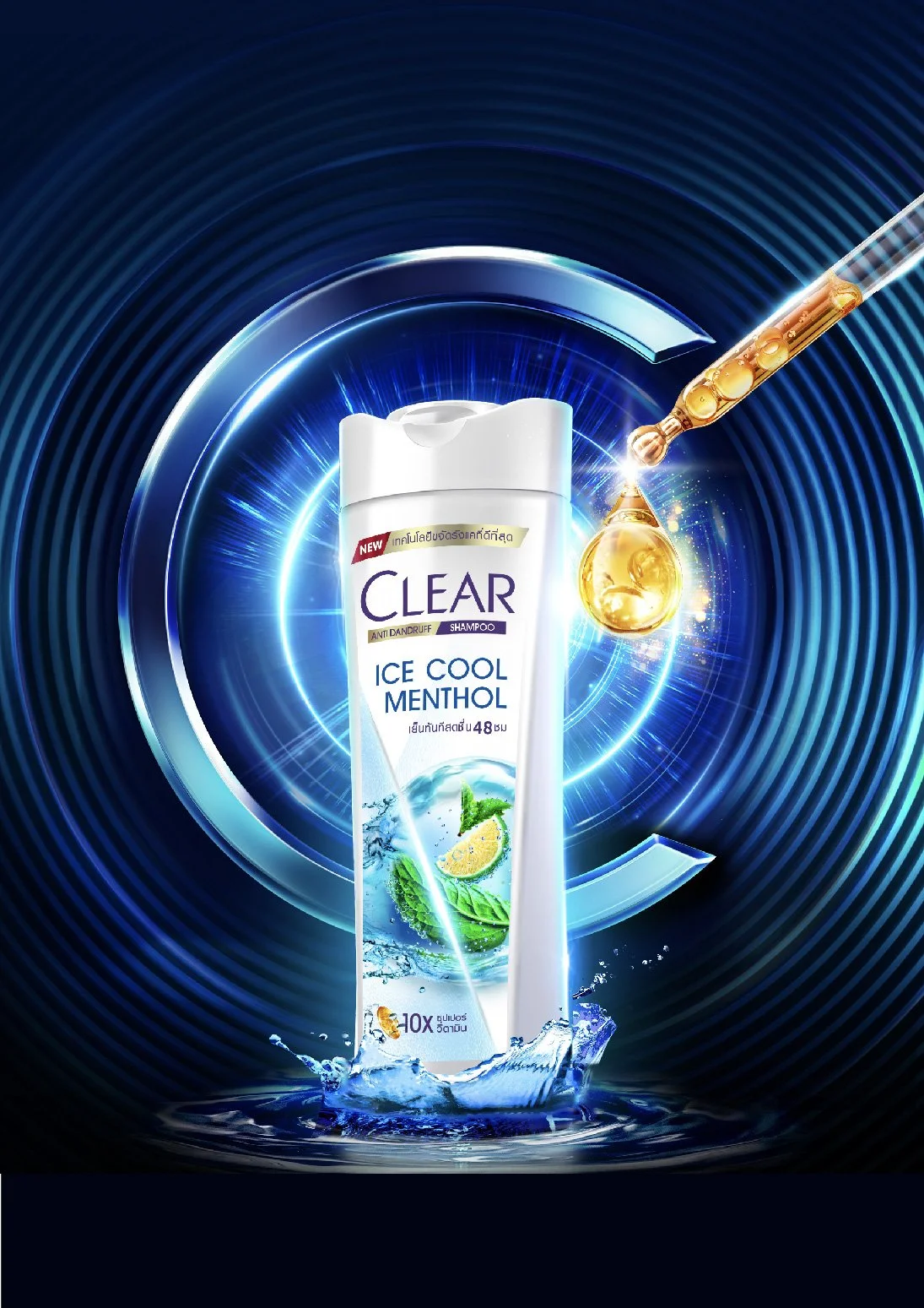
On pack, they hold the fresh ingredients, convey Clear’s superior technology or potent formula. .
THE BRIEF
An ownable, original brand asset easy to adapt to communications across different markets
Unifying Clear’s portfolio, Core & Premium
To deliver Clear’s Design toolkit with visuals for different portfolio across key touchpoints.
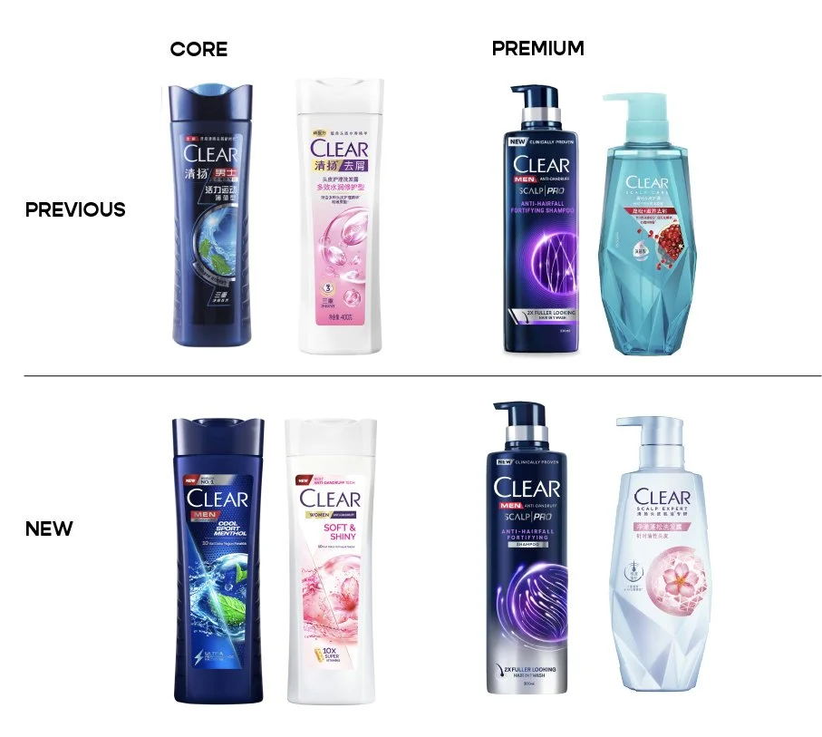
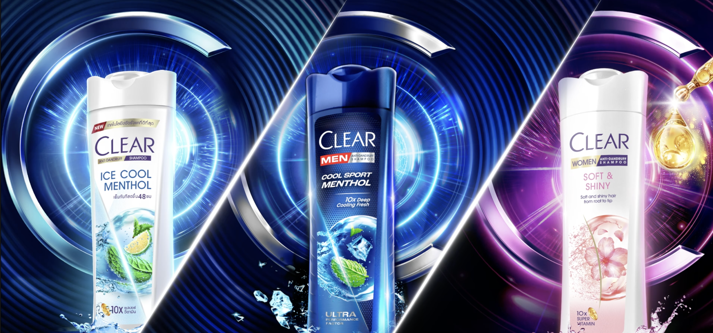
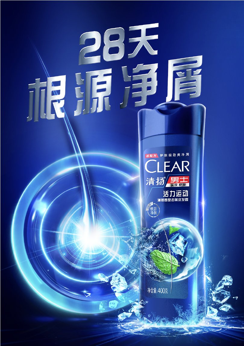
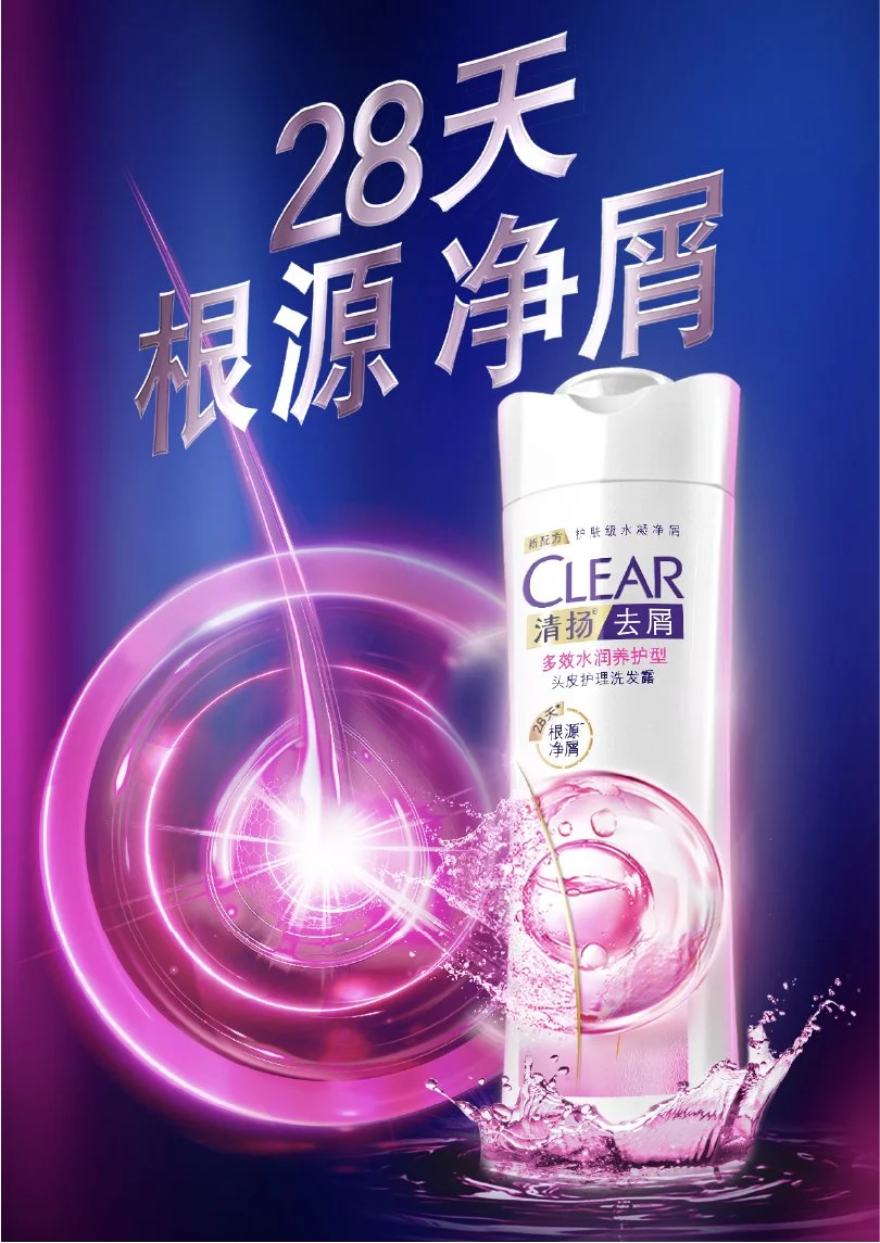
UPDATED PACKS
From being a performance-led shampoo, Clear wanted to head into the Scalp Expert space. Embodying a Scalp is Skin principle, a lot of skinification cues was included into the new packs.
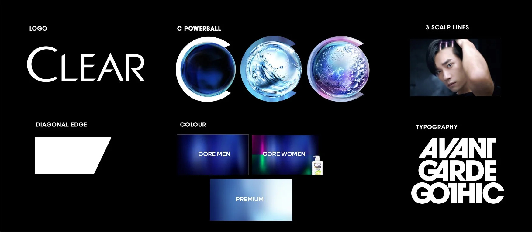
UPDATED LOGO
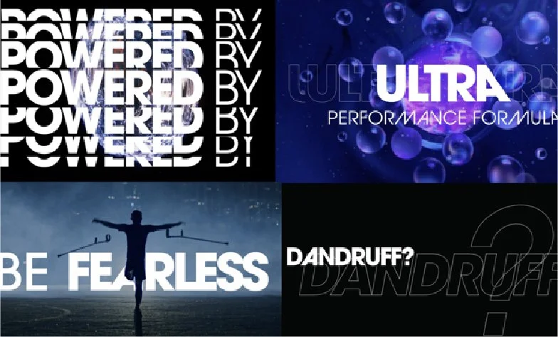
CORE RANGE REEL
To launch the new pack to the internal team, we were tasked to make a reel introducing the innovations and technology that went into making the formulation.
WHAT WE’VE DESIGNED ALONG THE WAY
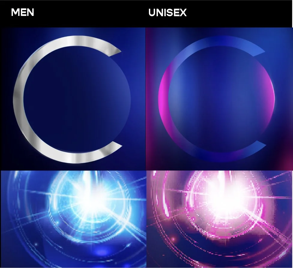
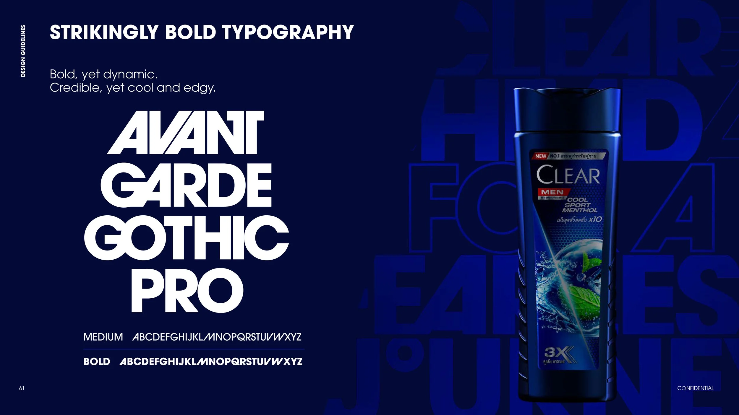
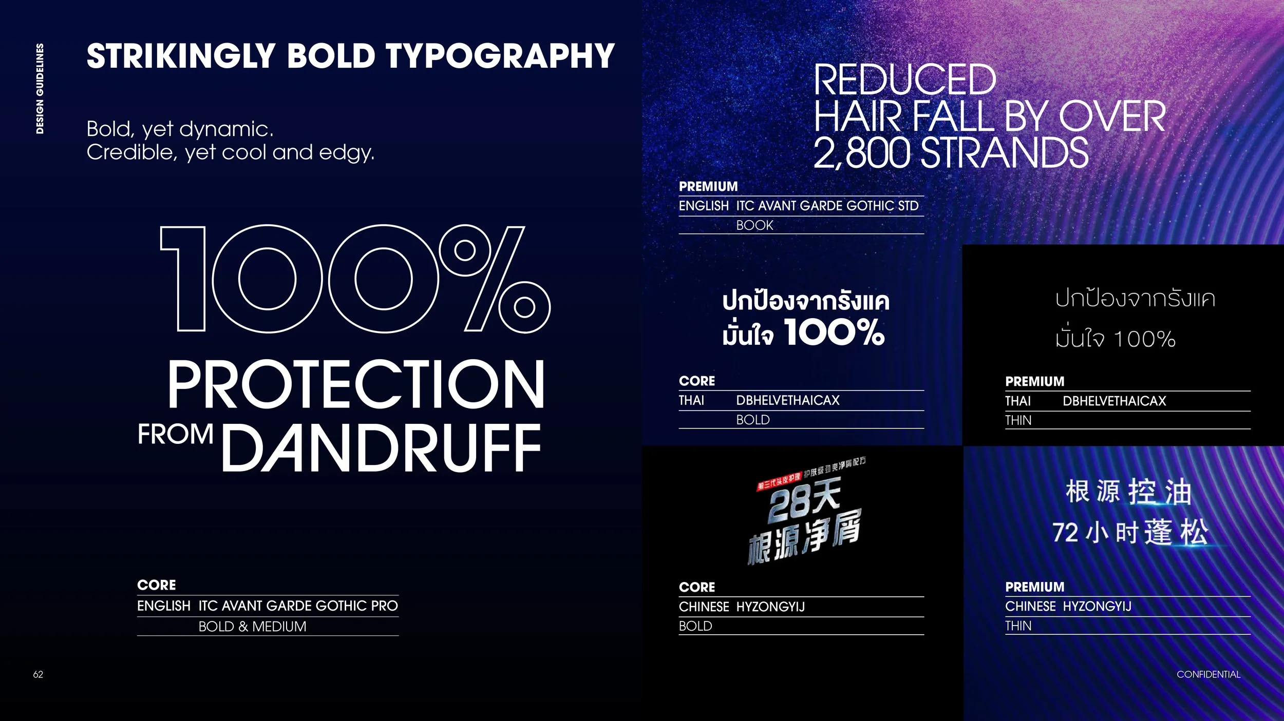
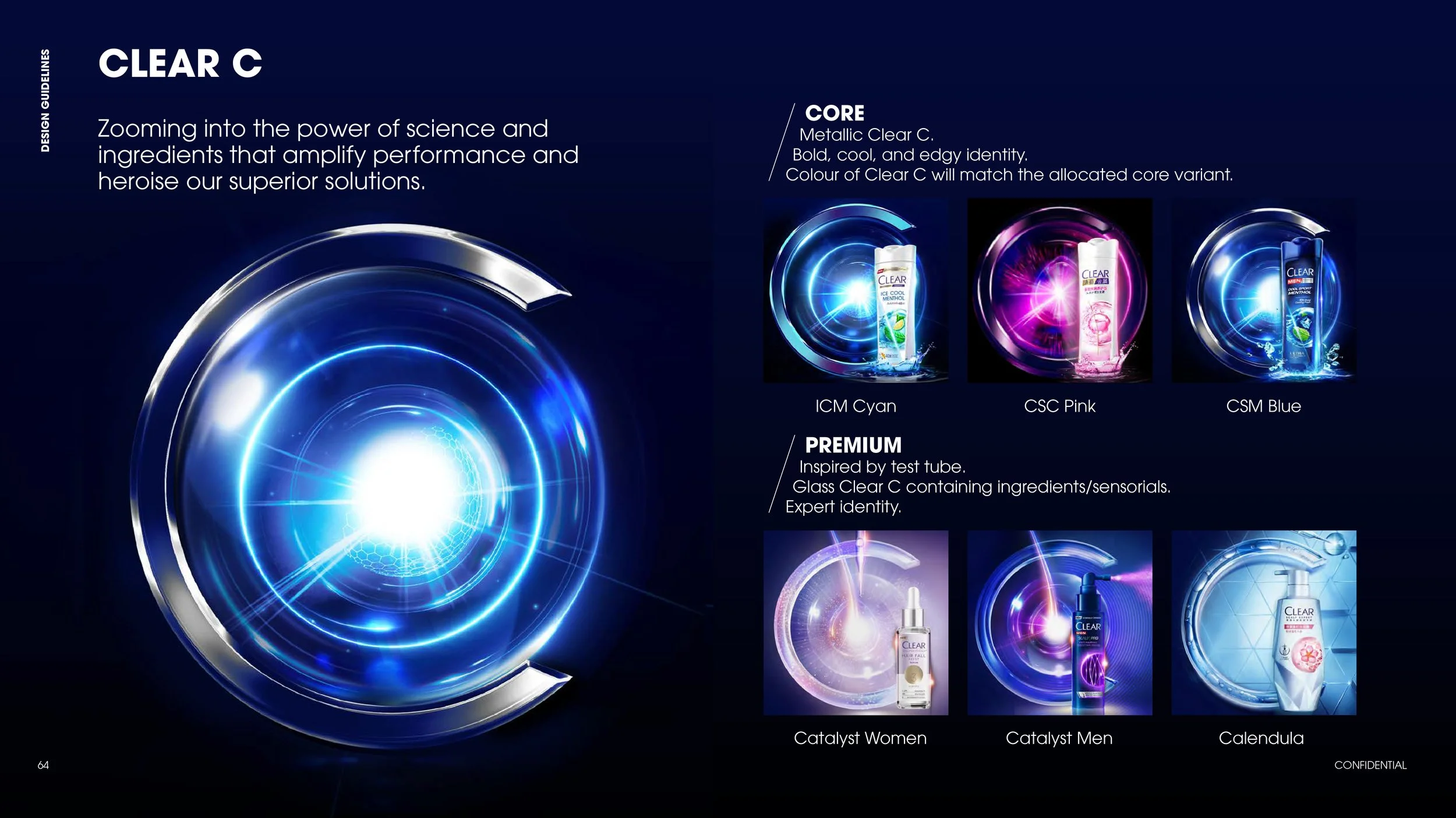
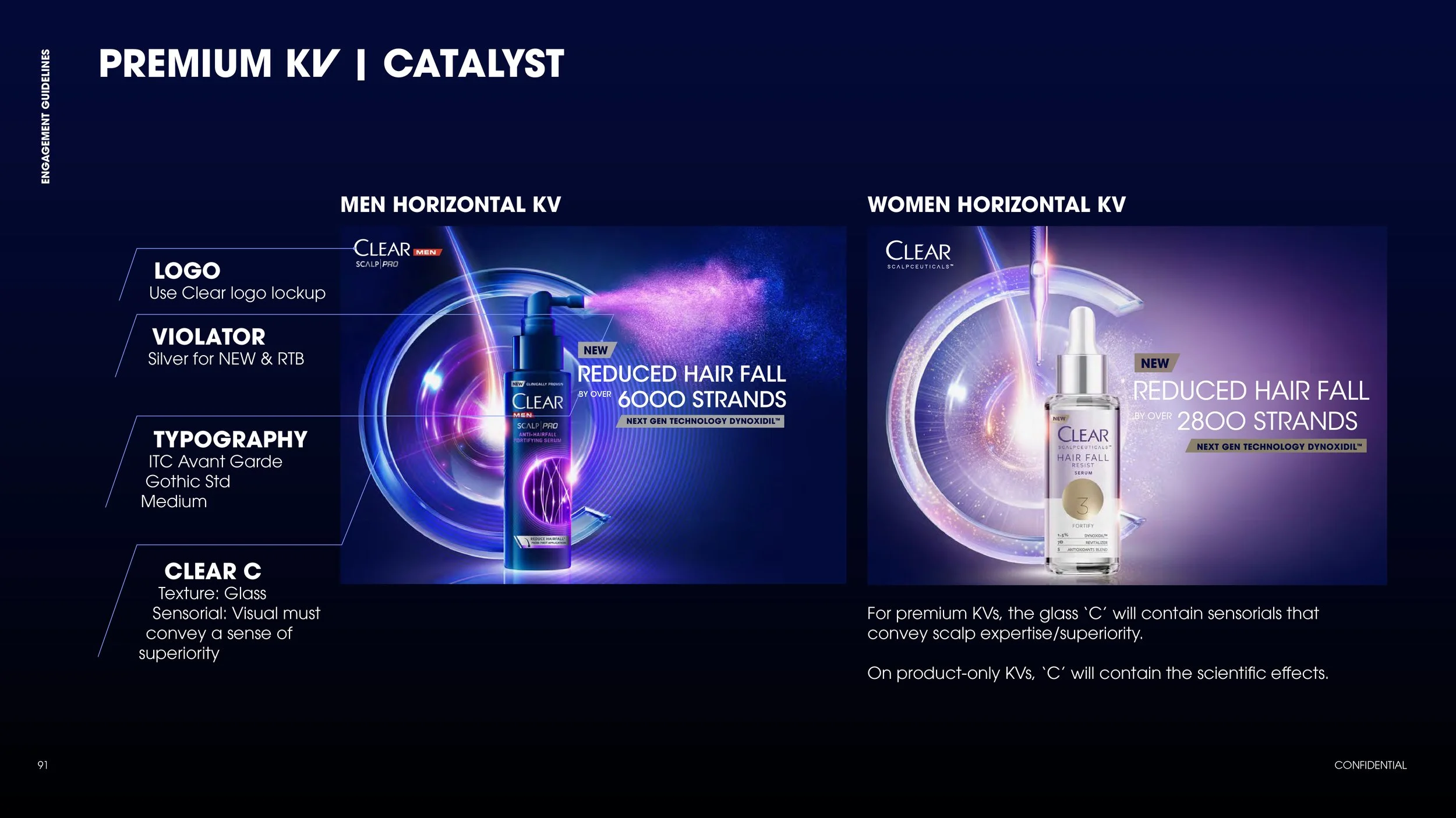
CLEAR C & TYPOGRAPHY
INITIAL DIRECTION
EXPLORATIONS
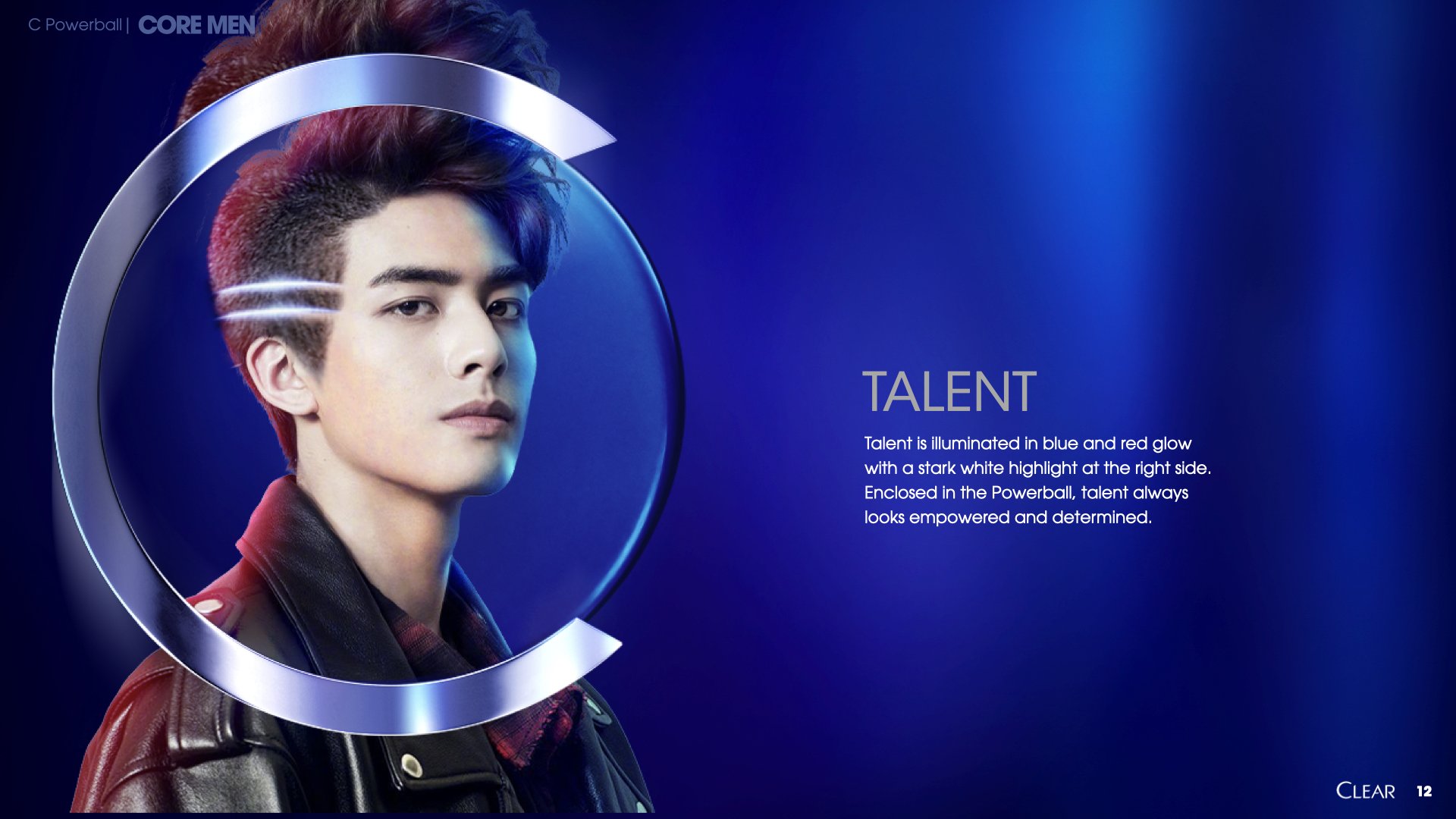
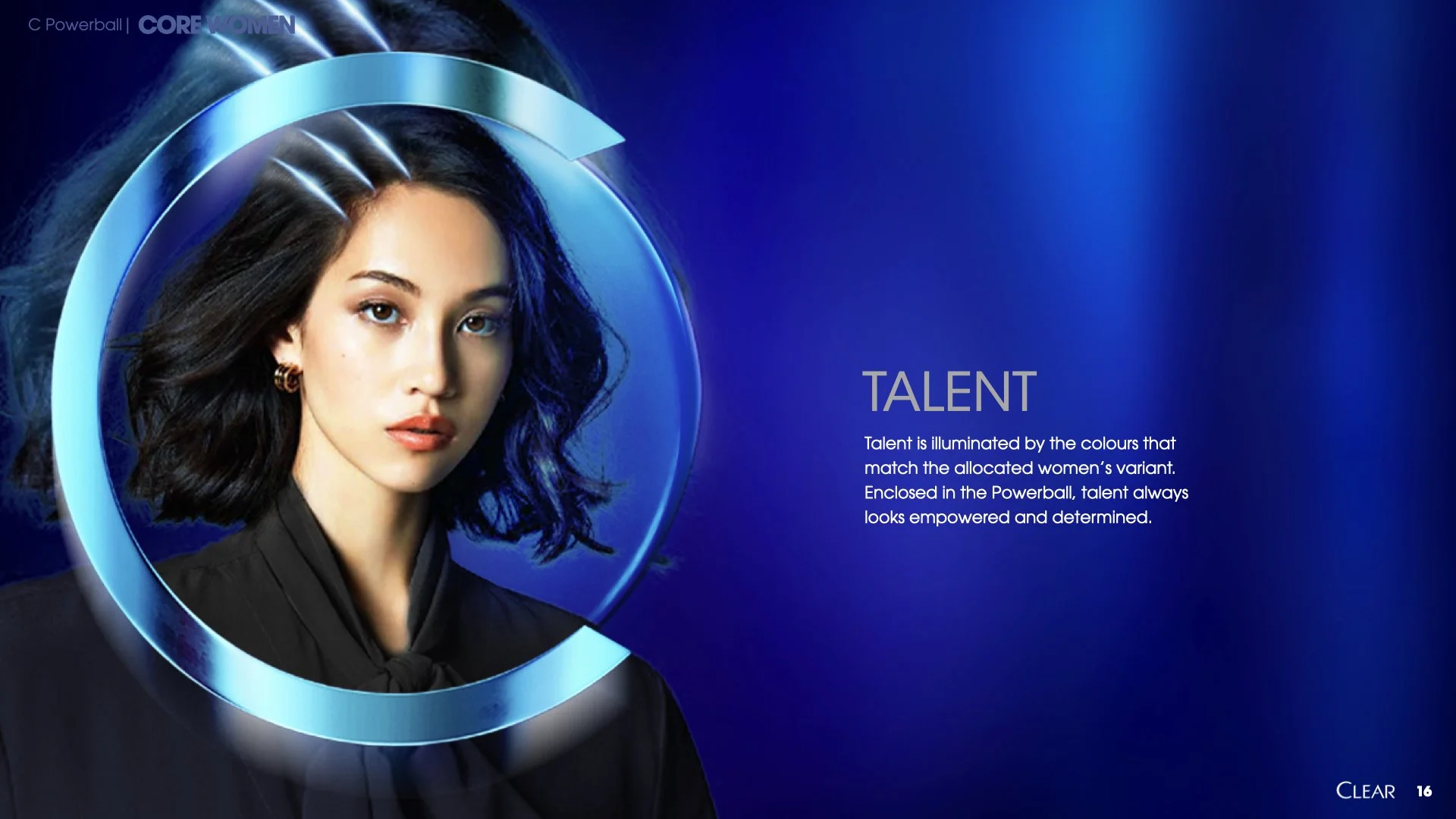
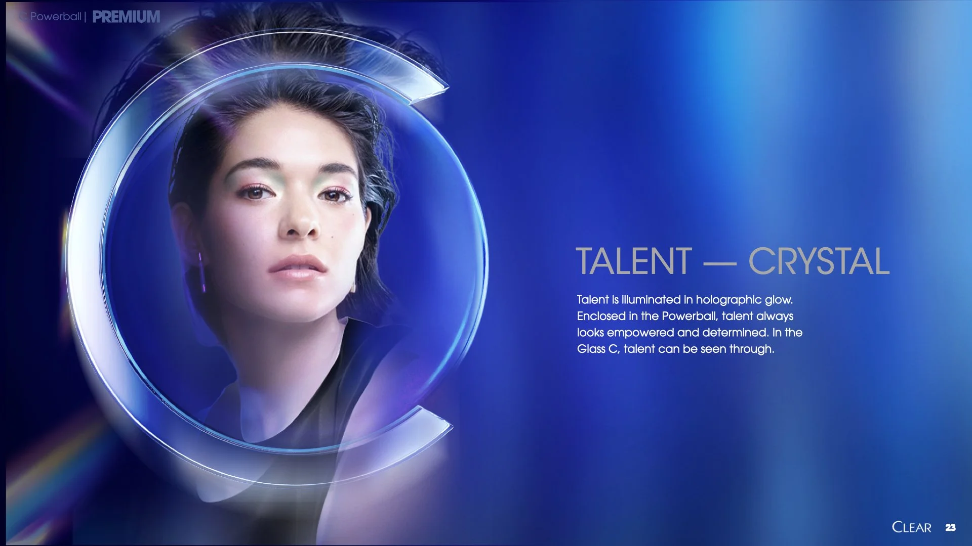
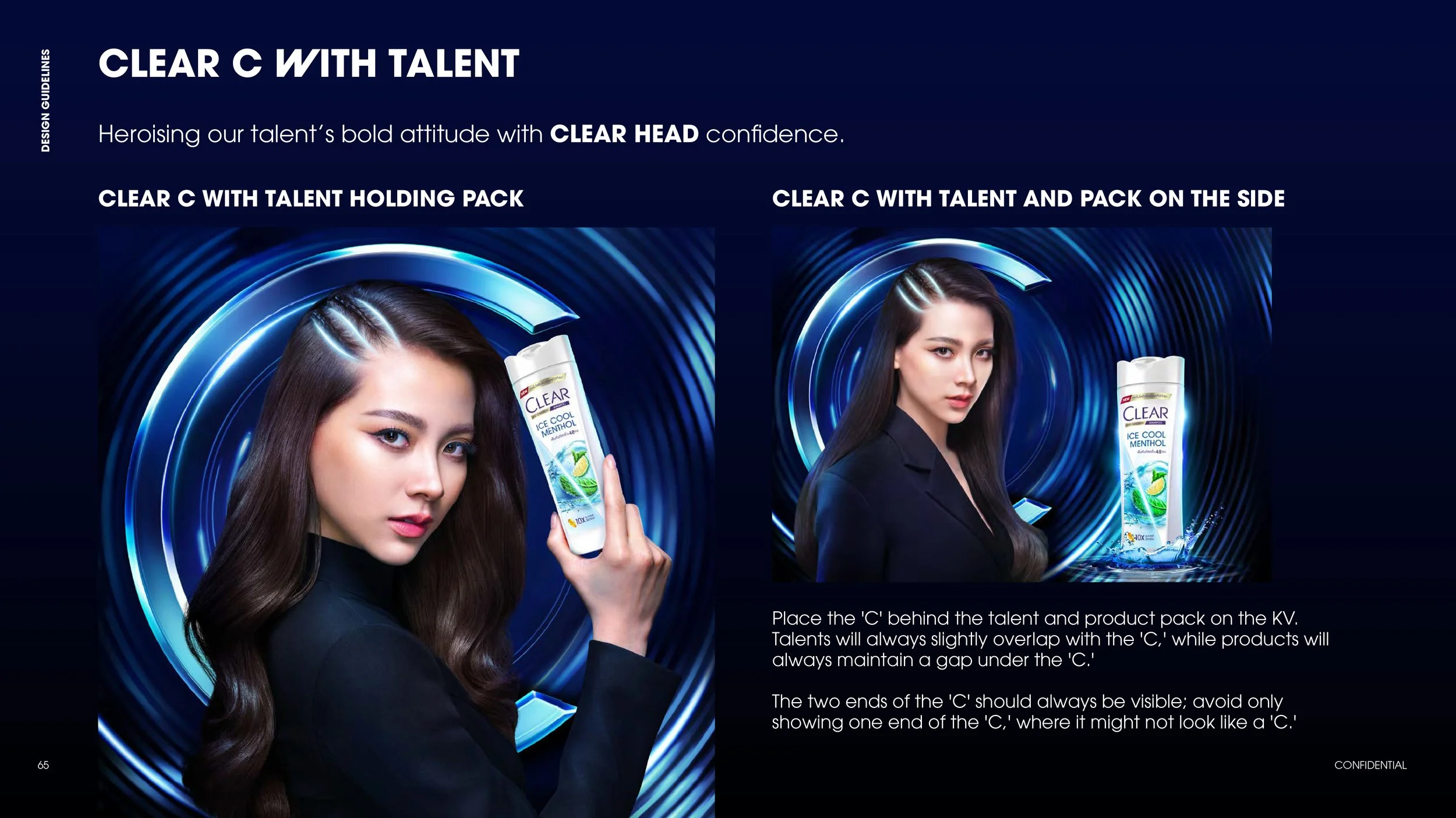
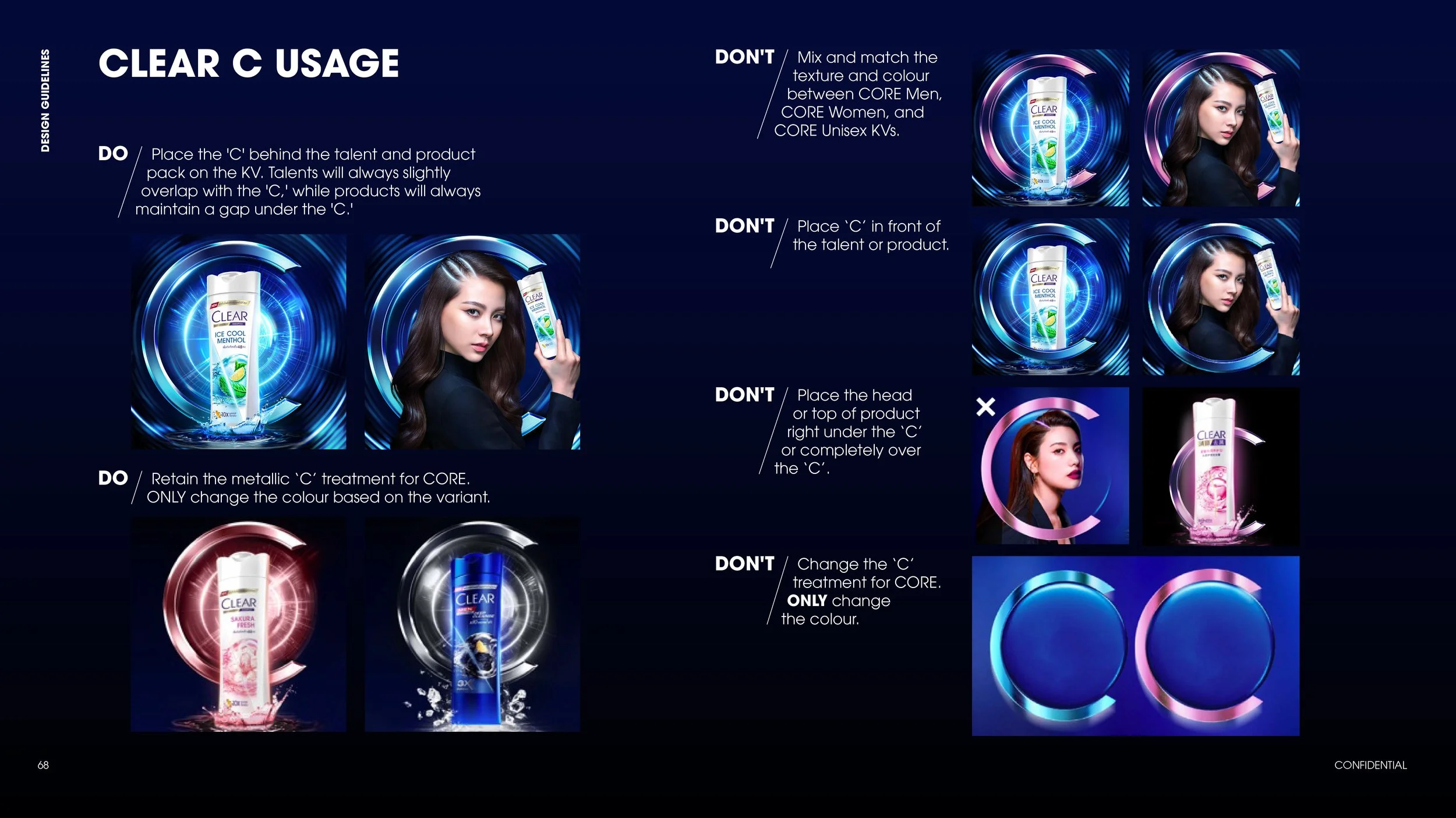
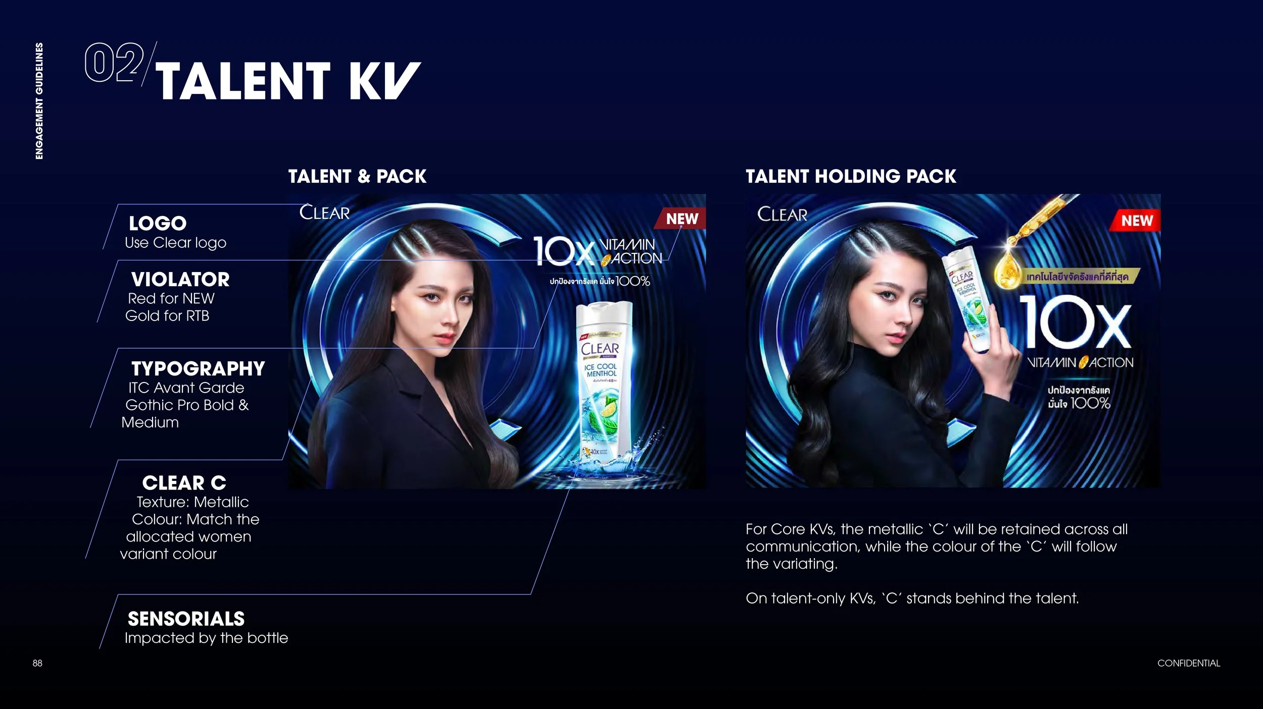
HOW CLEAR C INTERACTS WITH THE TALENT & PRODUCT
ROUND 1 PRESENTATION
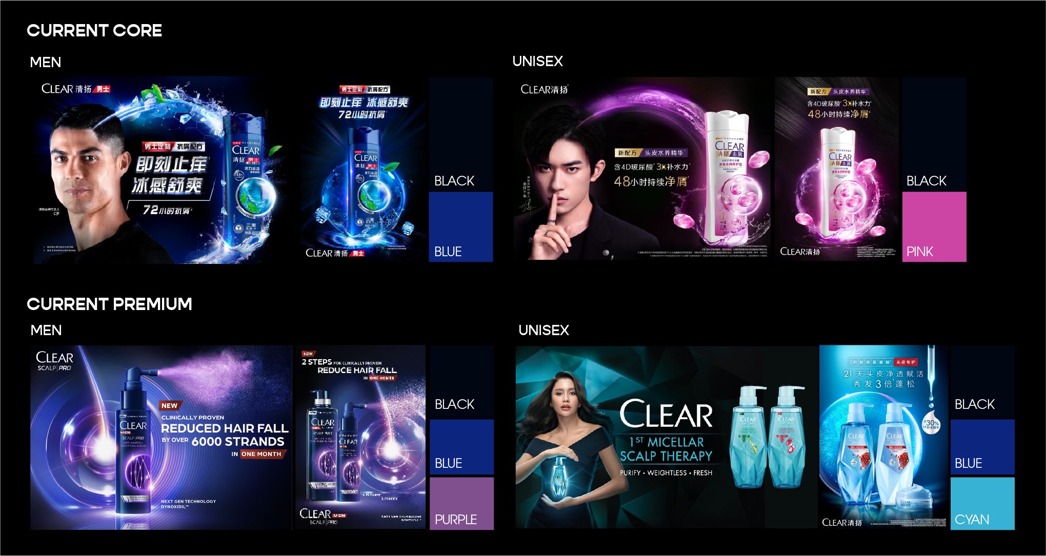
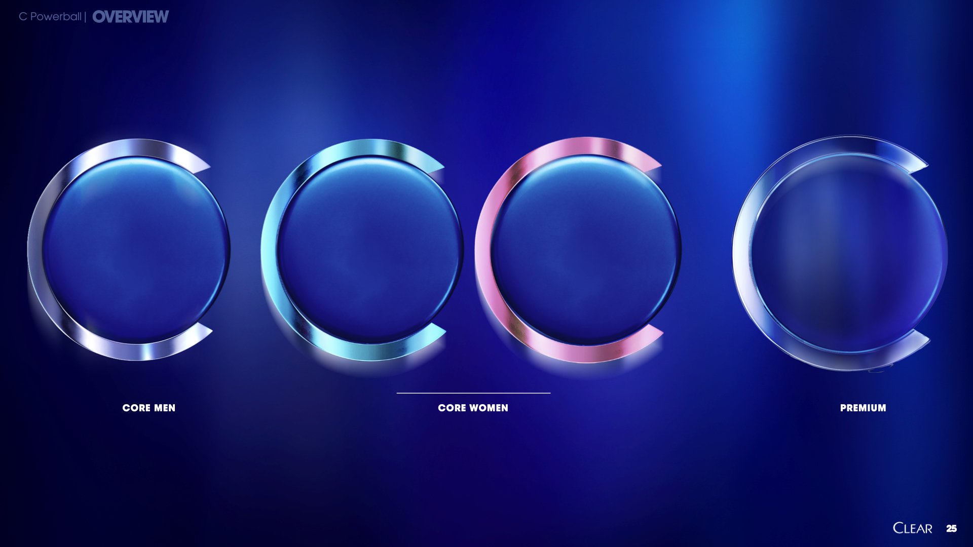
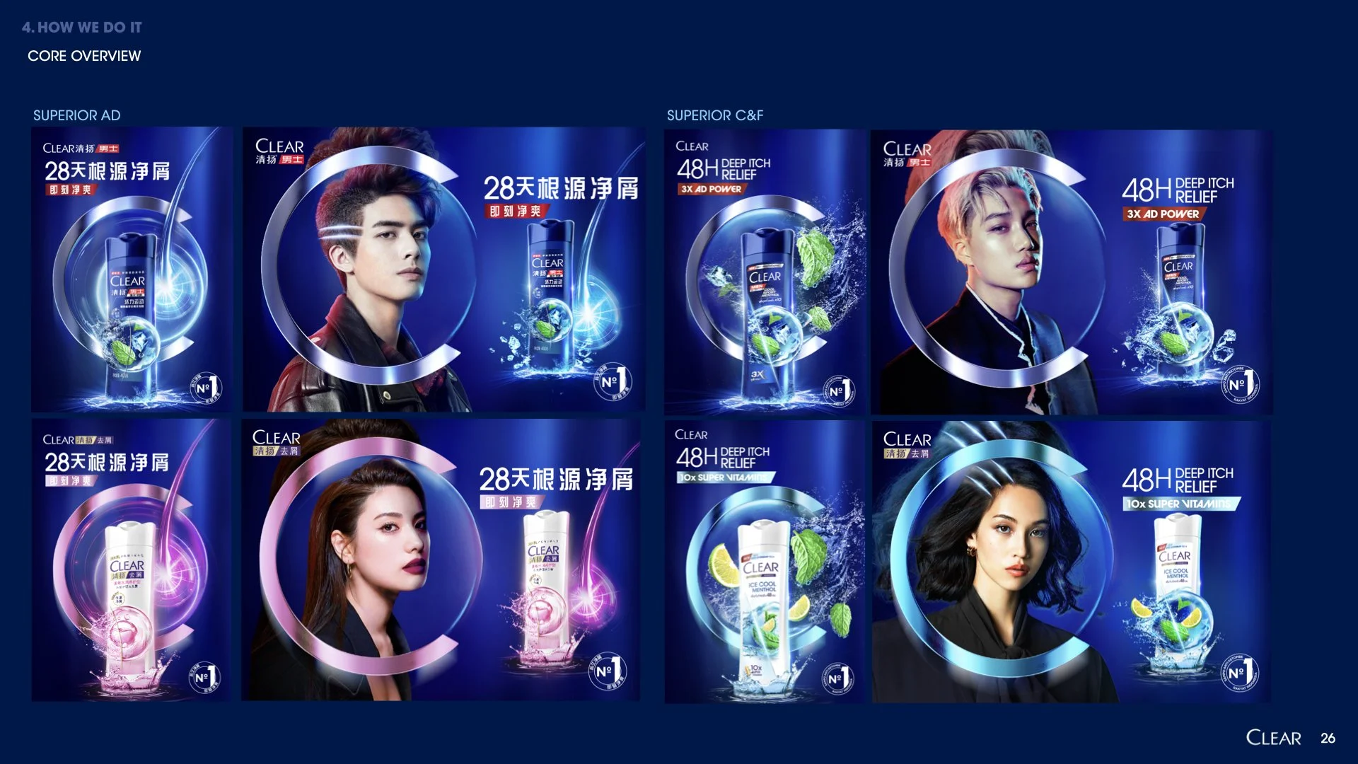
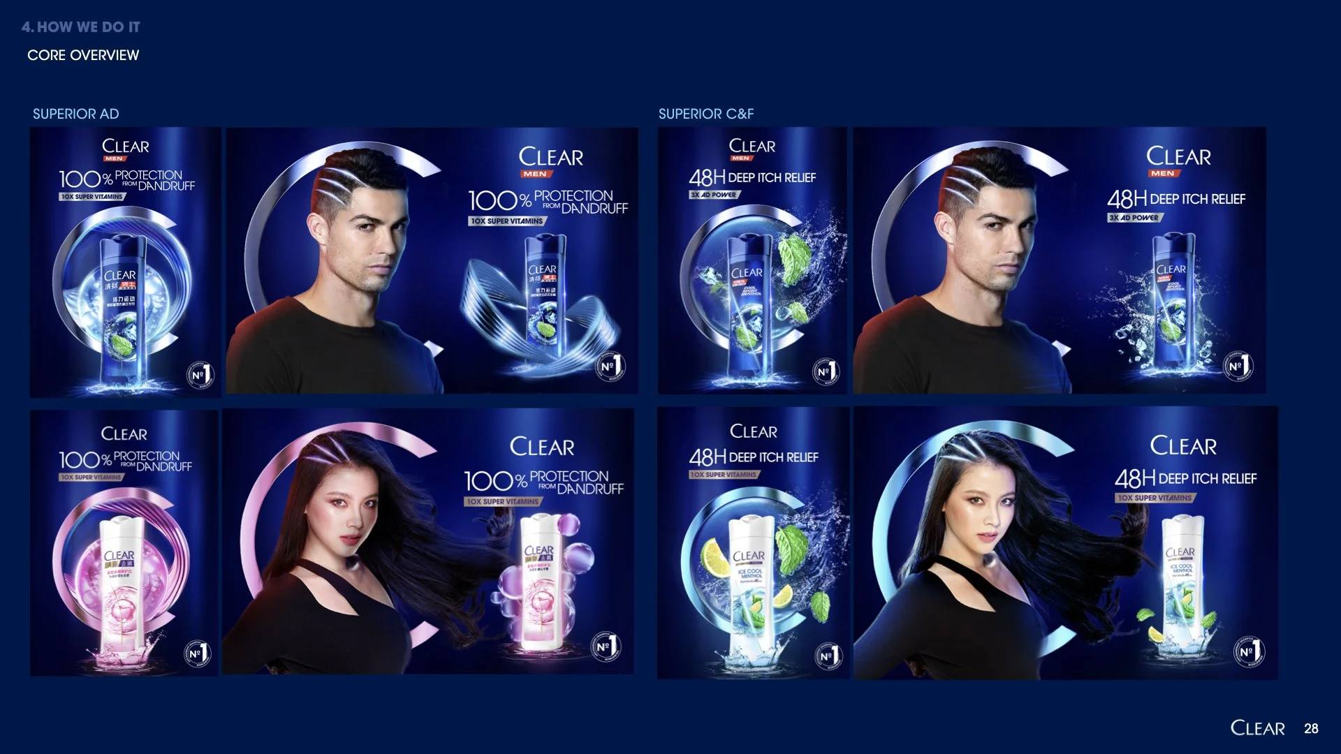
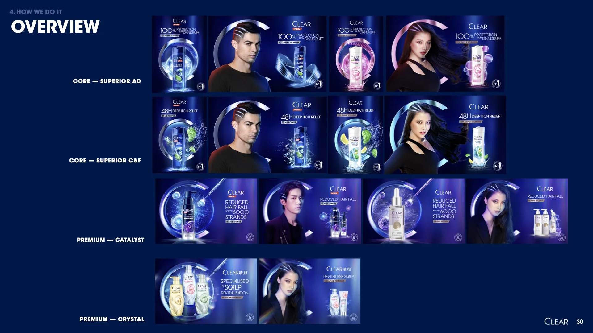
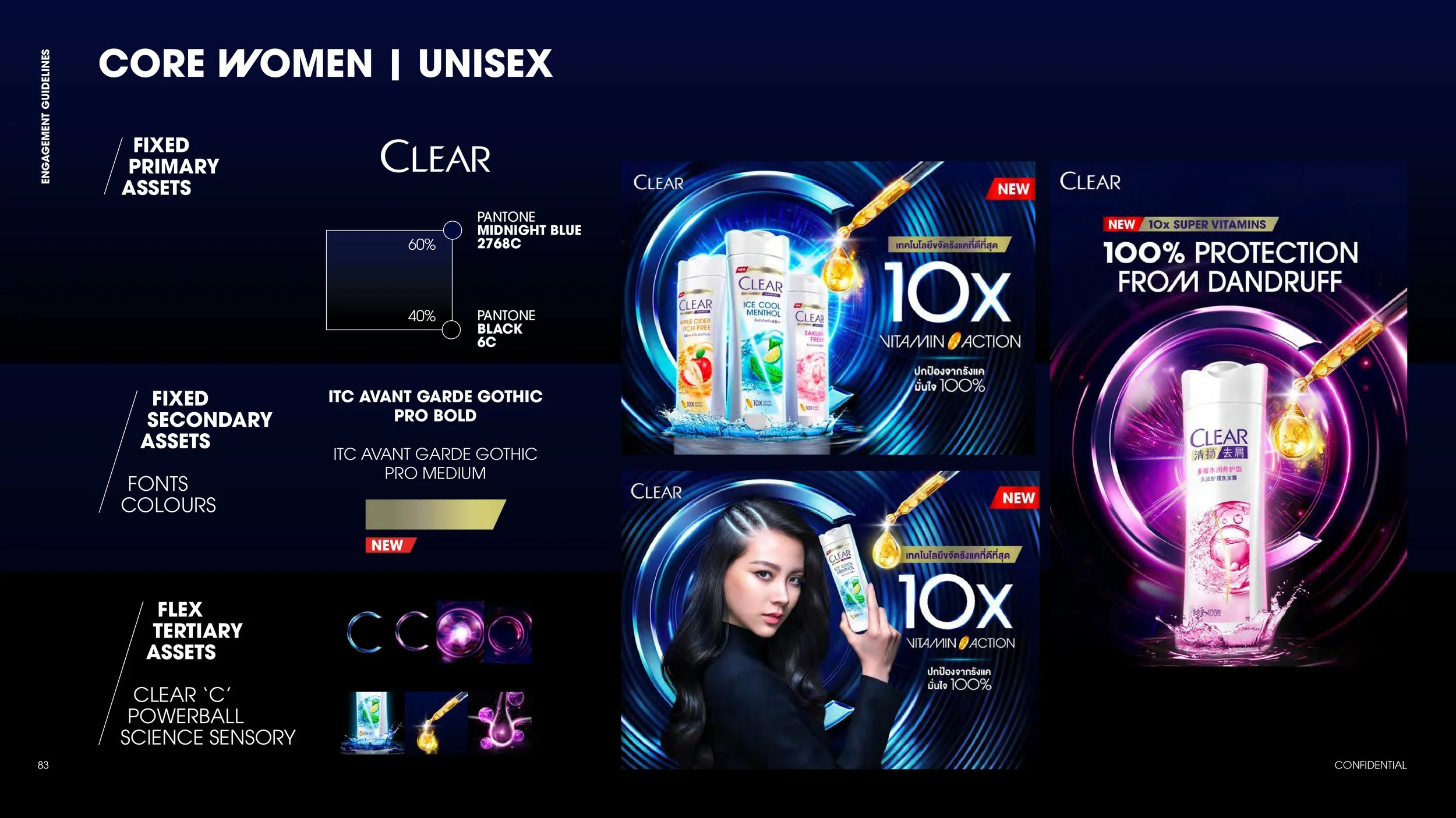
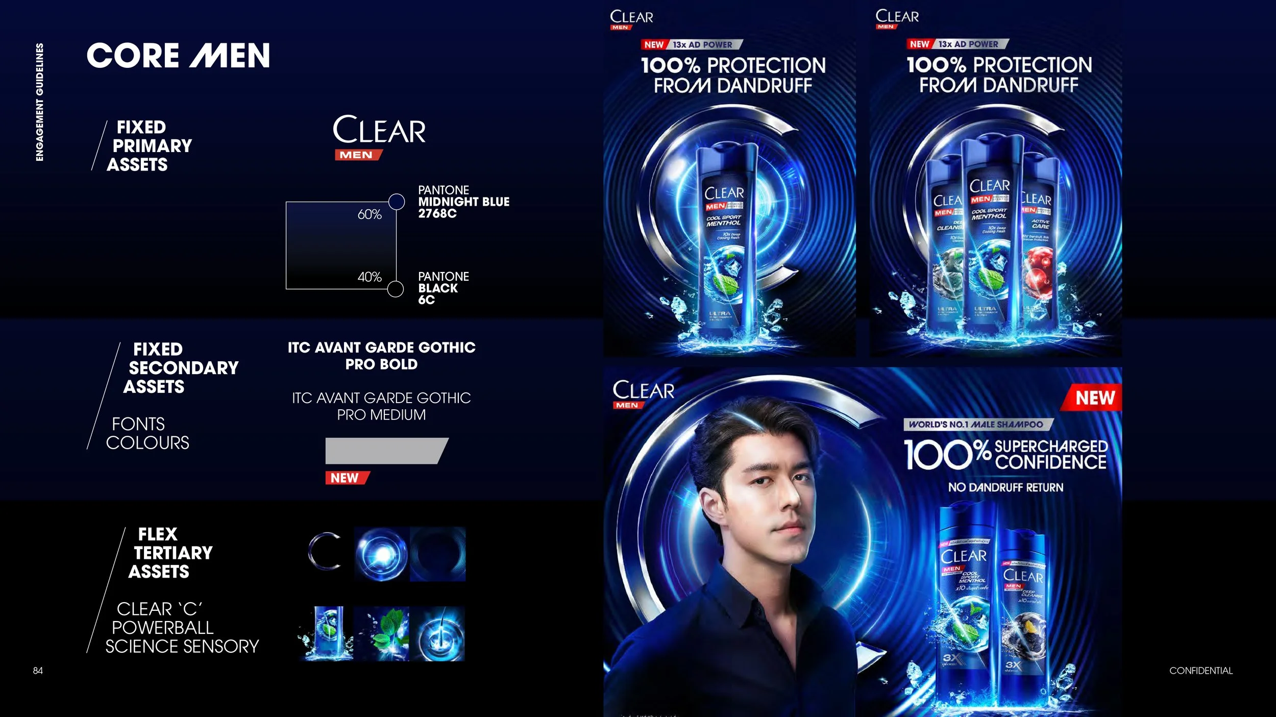
CORE RANGE ASSETS
Clear core is all about superiority in anti-dandruffperformance & ingredients.
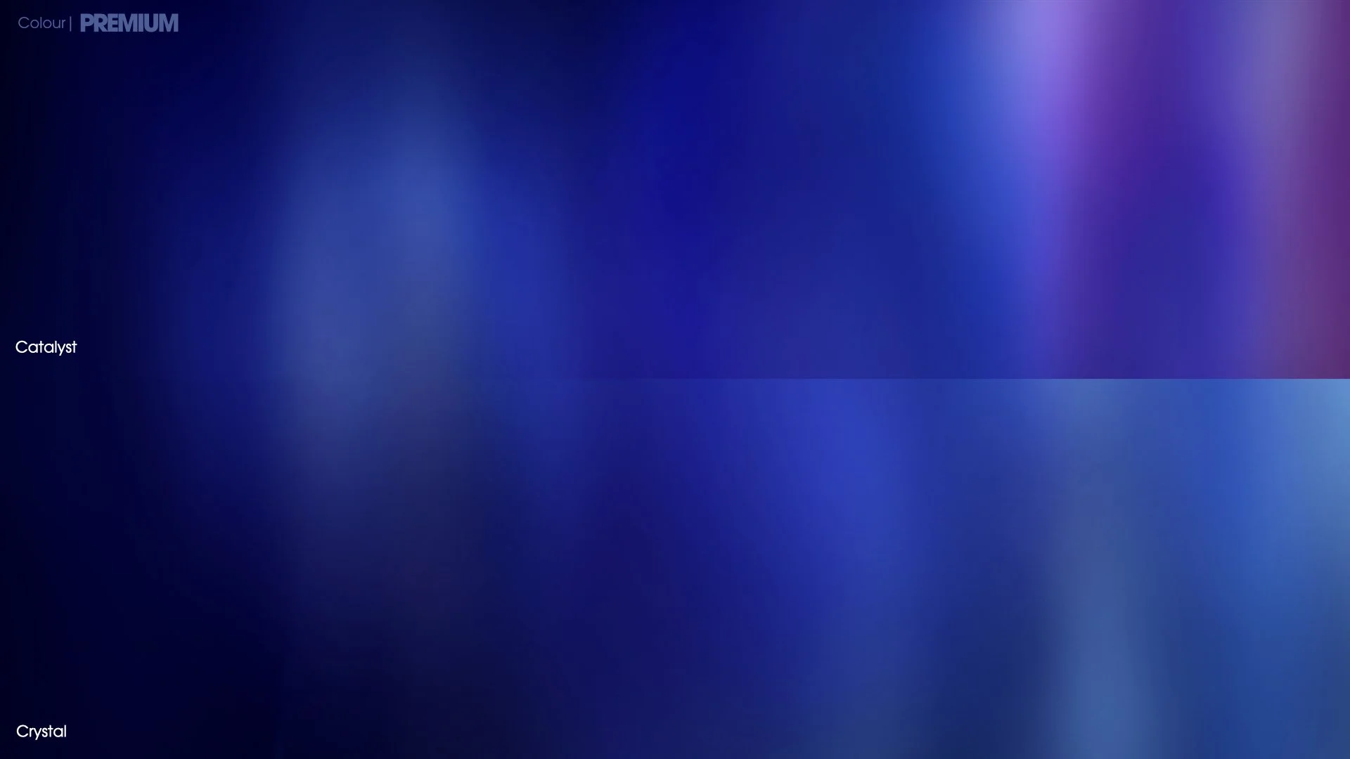
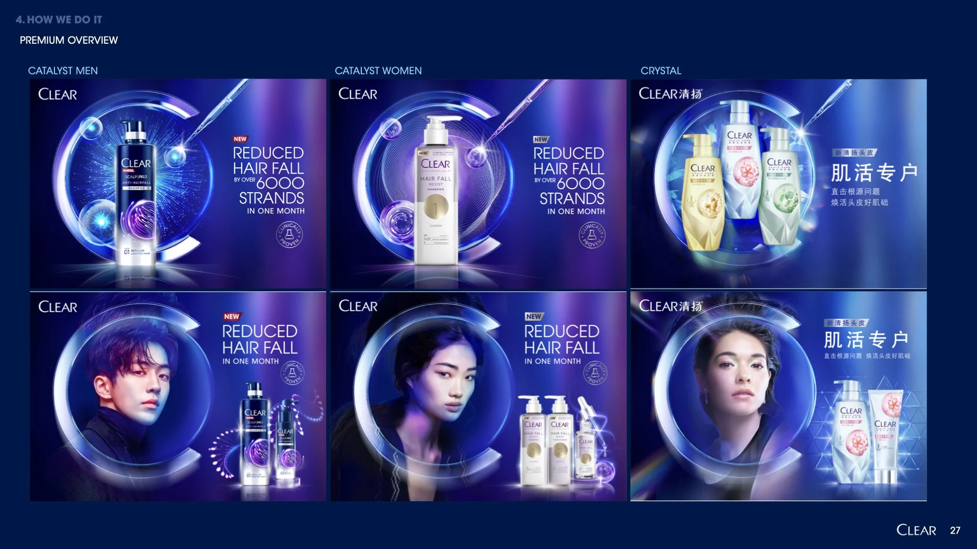
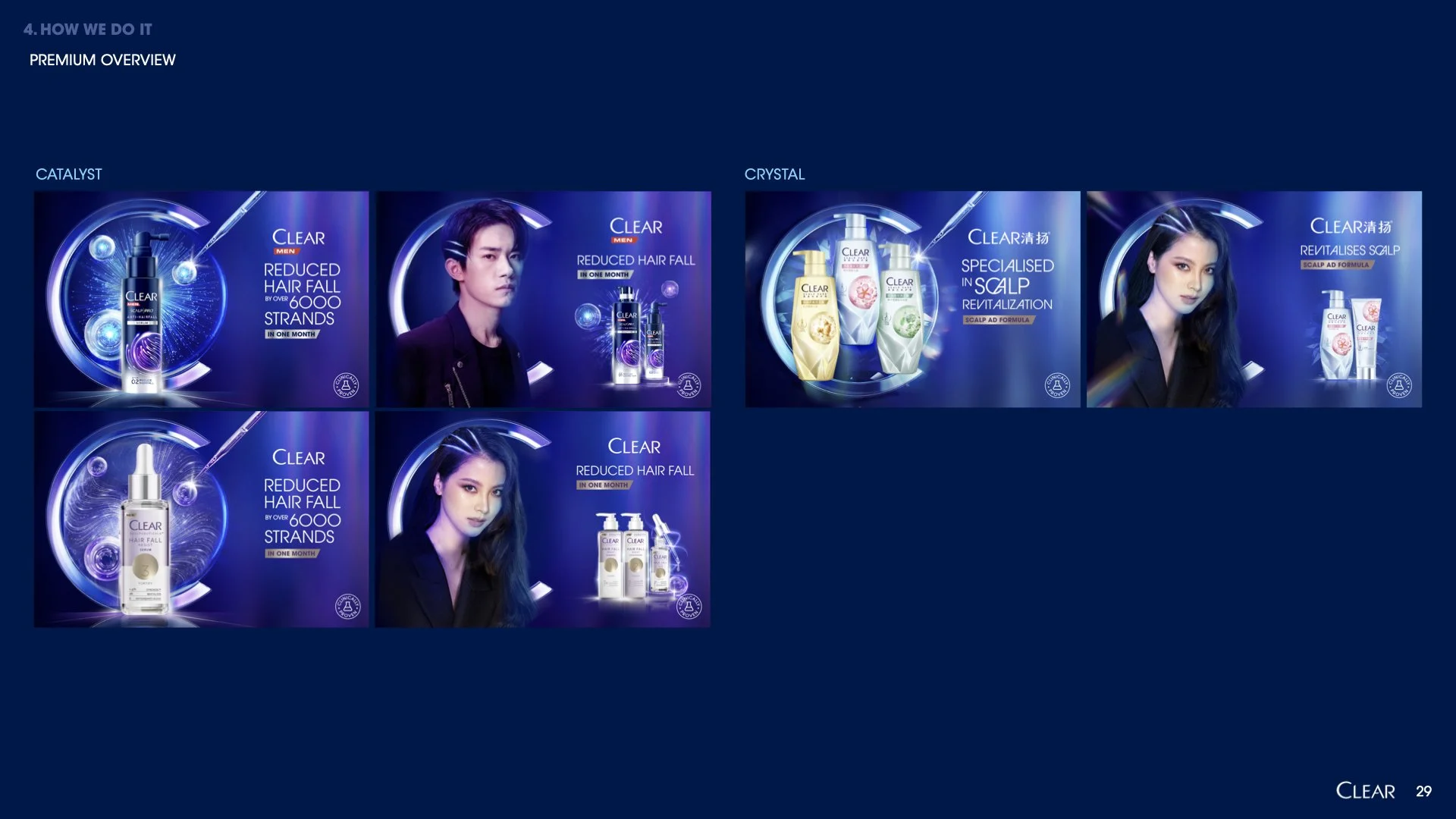
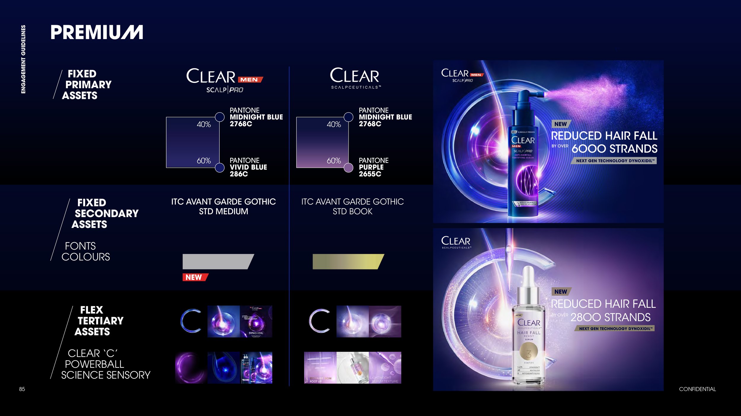
PREMIUM RANGE ASSETS
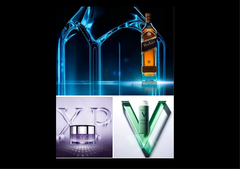
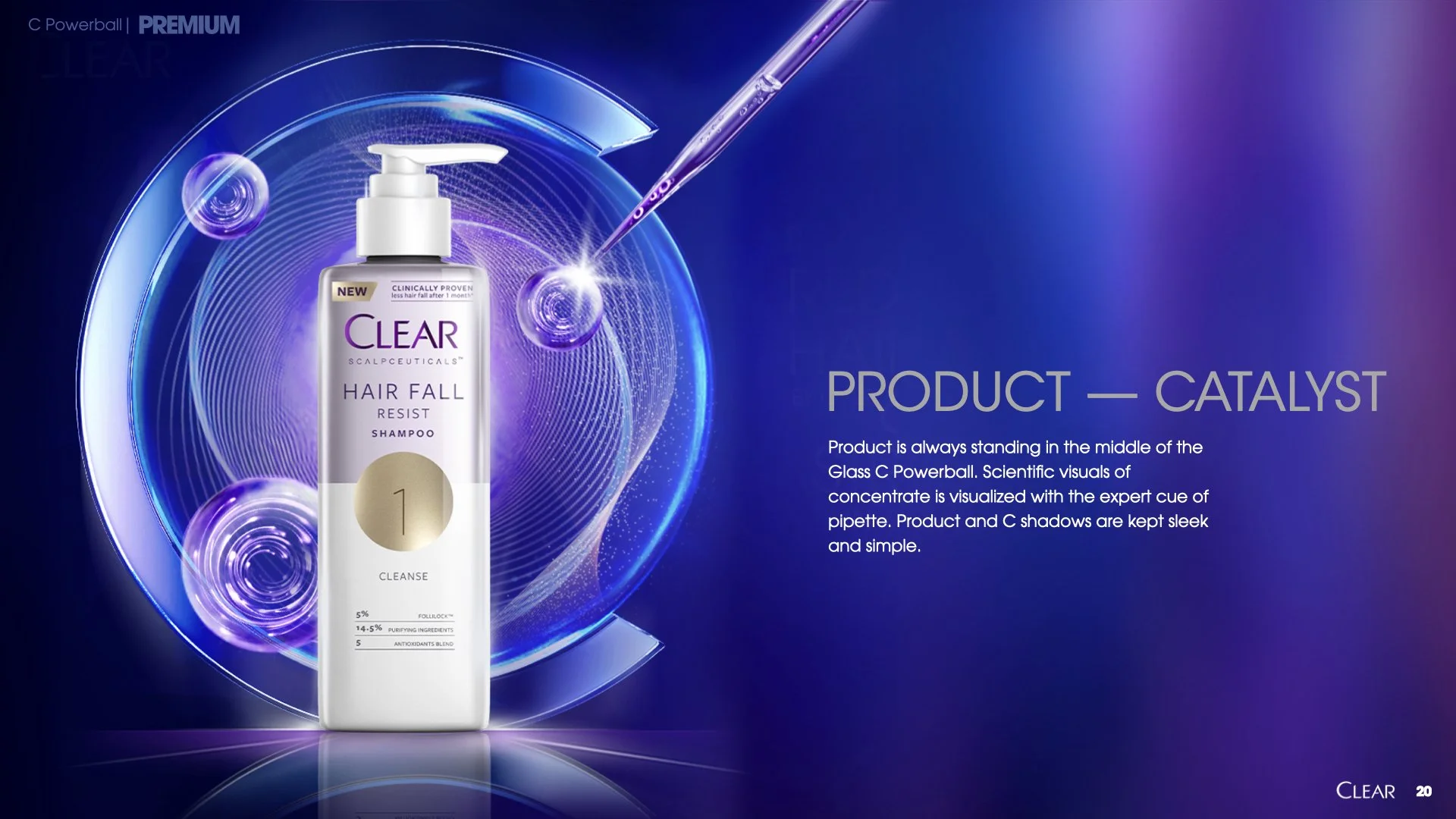
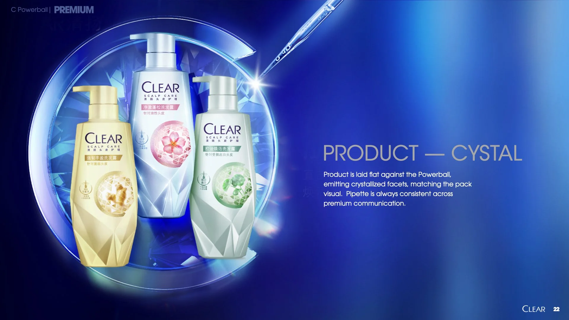
Visualise Clear’s progressive innovations and clinical expertise through the laboratory equipments.
ROUND 1 FEEDBACK
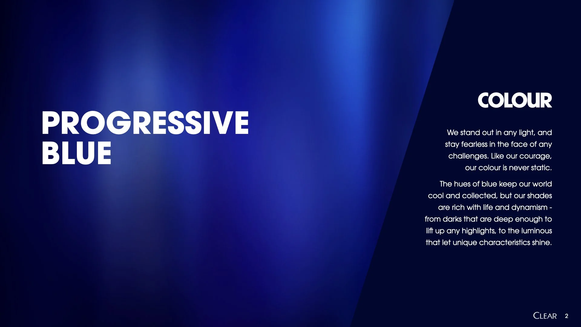
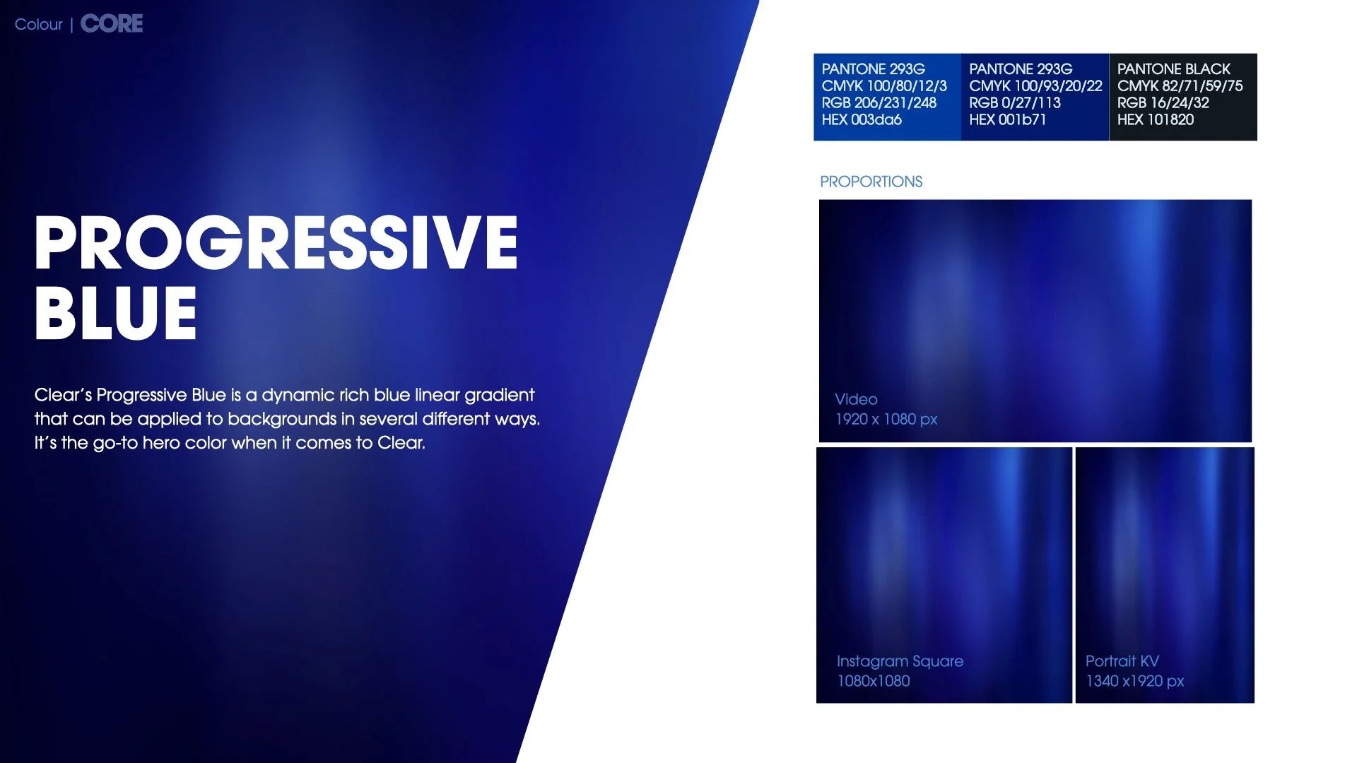
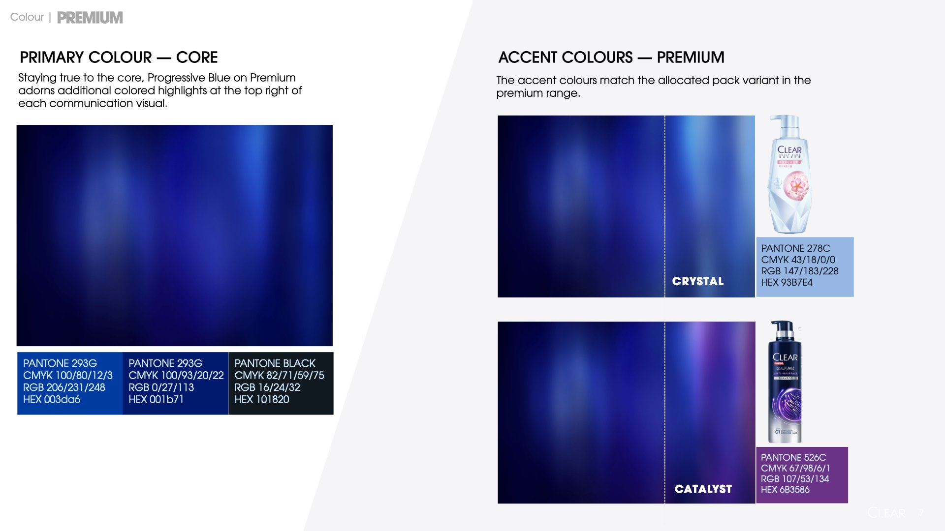
COLOUR
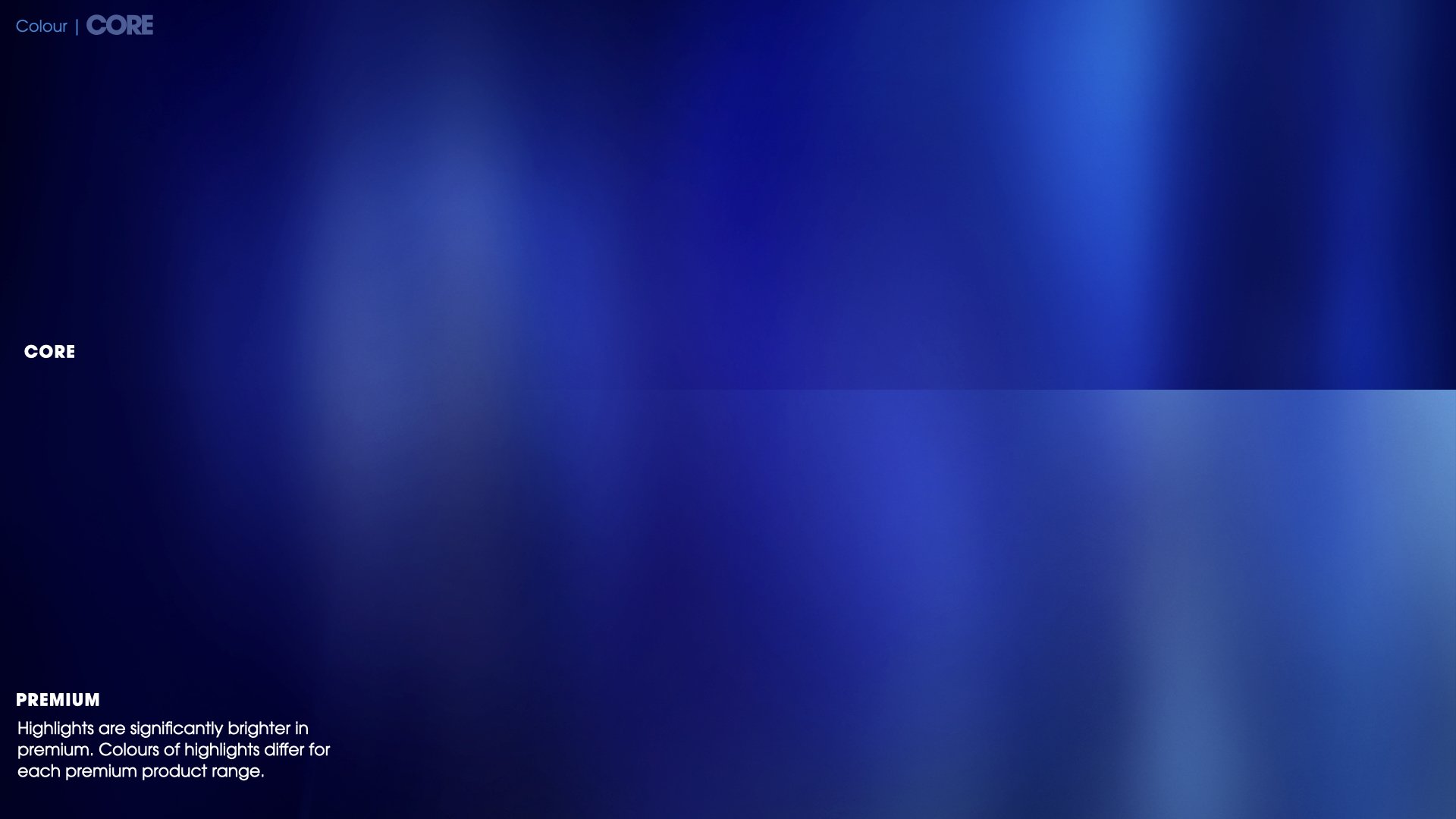
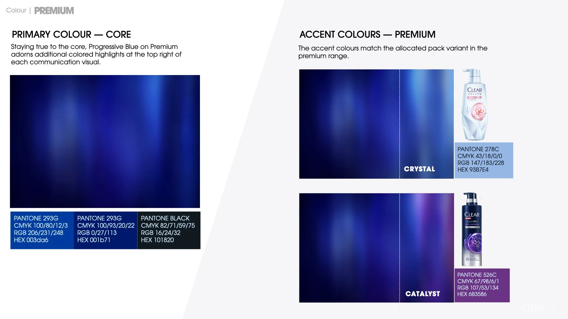
The Progressive Blue Gradient does answer to the dynamic nature of Clear, but foresee a difficulty to adapt to other sizes. Premium colours need to be darker & still be cohesive with Core.
PREMIUM RANGE ASSETS
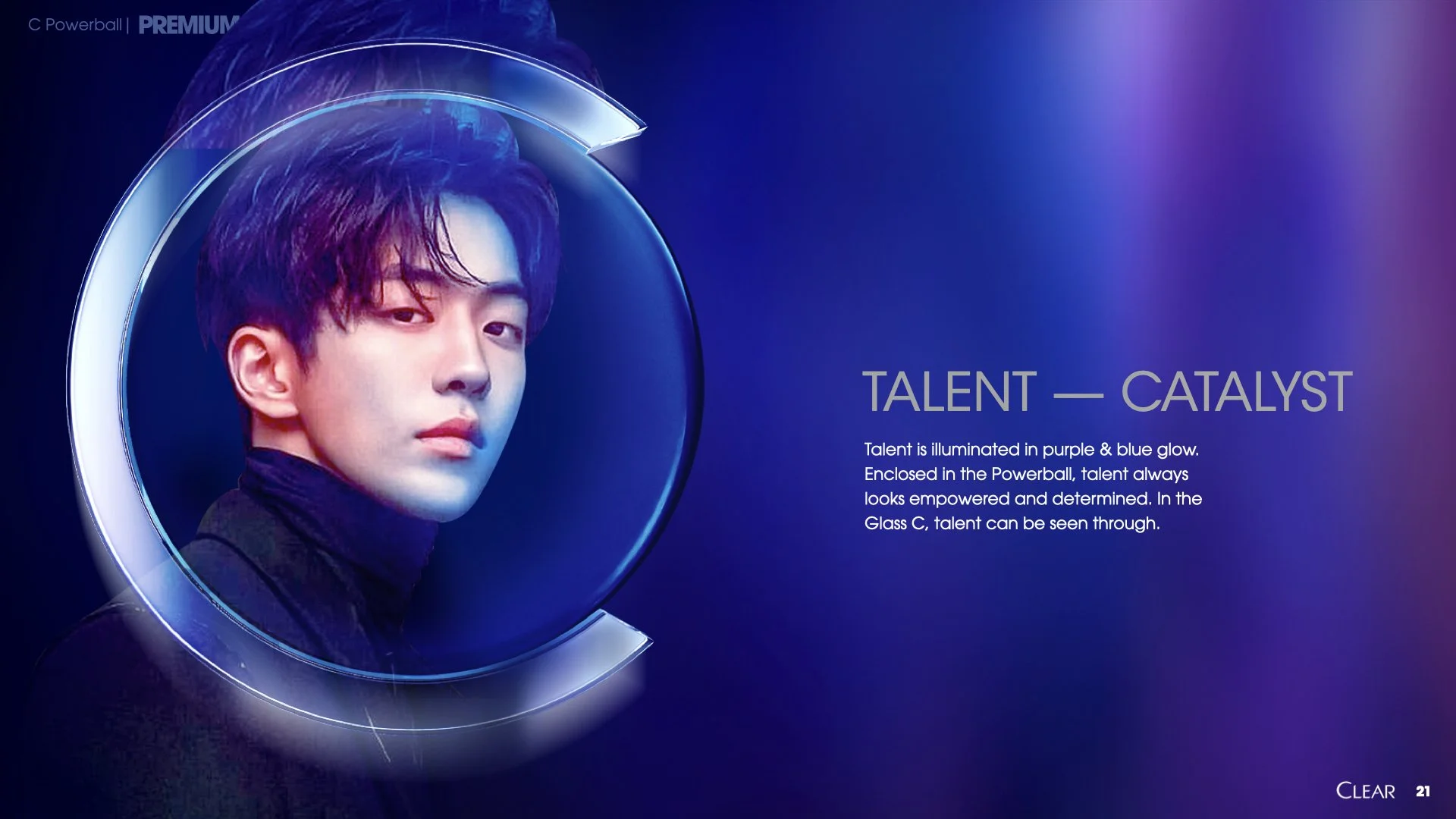
The C in the talent KV covers the hair, missing the point that its a haircare brand. The materials for the C also needed to be relooked & they currently do not look consistent among the ranges.
ROUND 2 Presentation
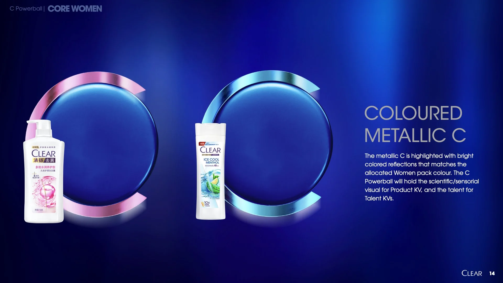
CORE CLEAR C TEXTURE
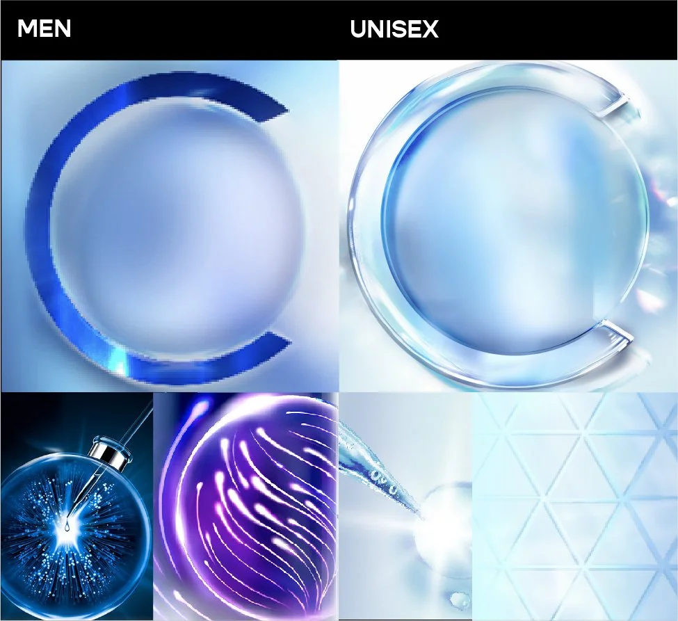
Reflective metals & high shine.
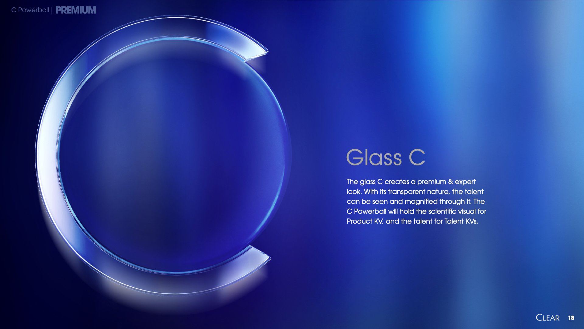
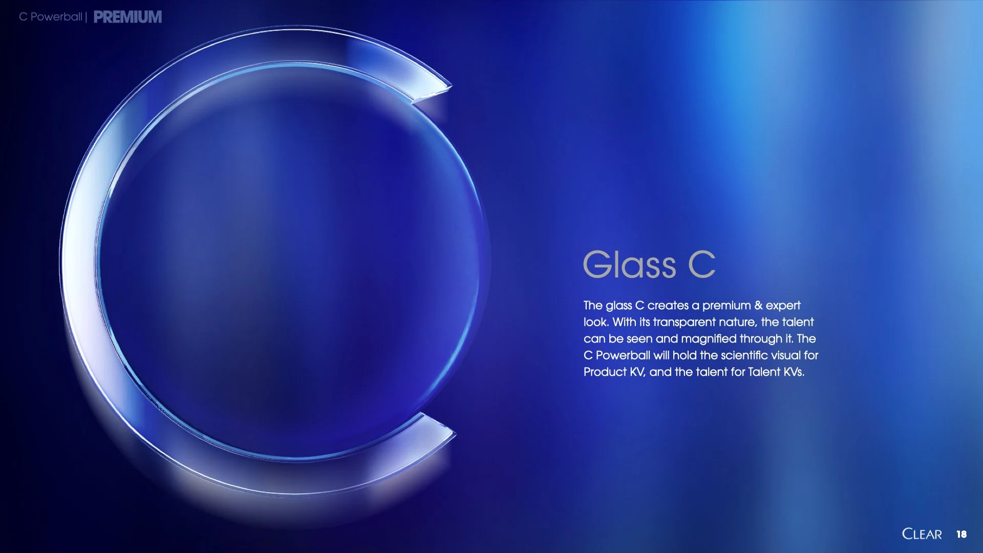
PREMIUM CLEAR C TEXTURE
Transparent Glass, reminiscent of materials of lab tools like the pippette.


ROUND 3 PRESENTATION
KEY VISUALS
This brandbook was then paused to prioritise the launch key visuals for the new packs while keeping in mind that the new key visuals need to adhere to the aforementioned design principles.
CORE WOMEN THAILAND KEY VISUAL
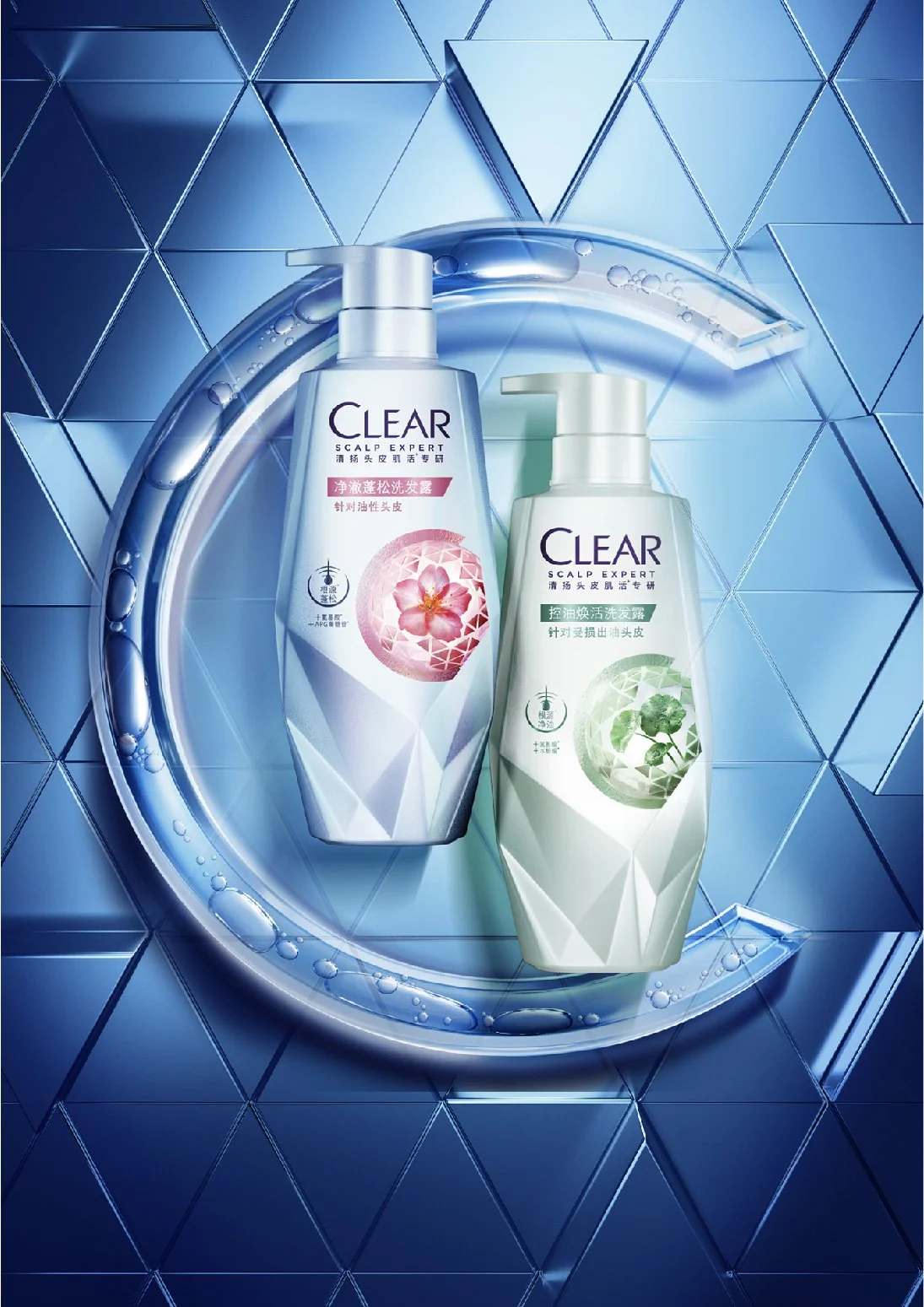
PREMIUM CRYSTAL WOMEN CHINA KEY VISUAL
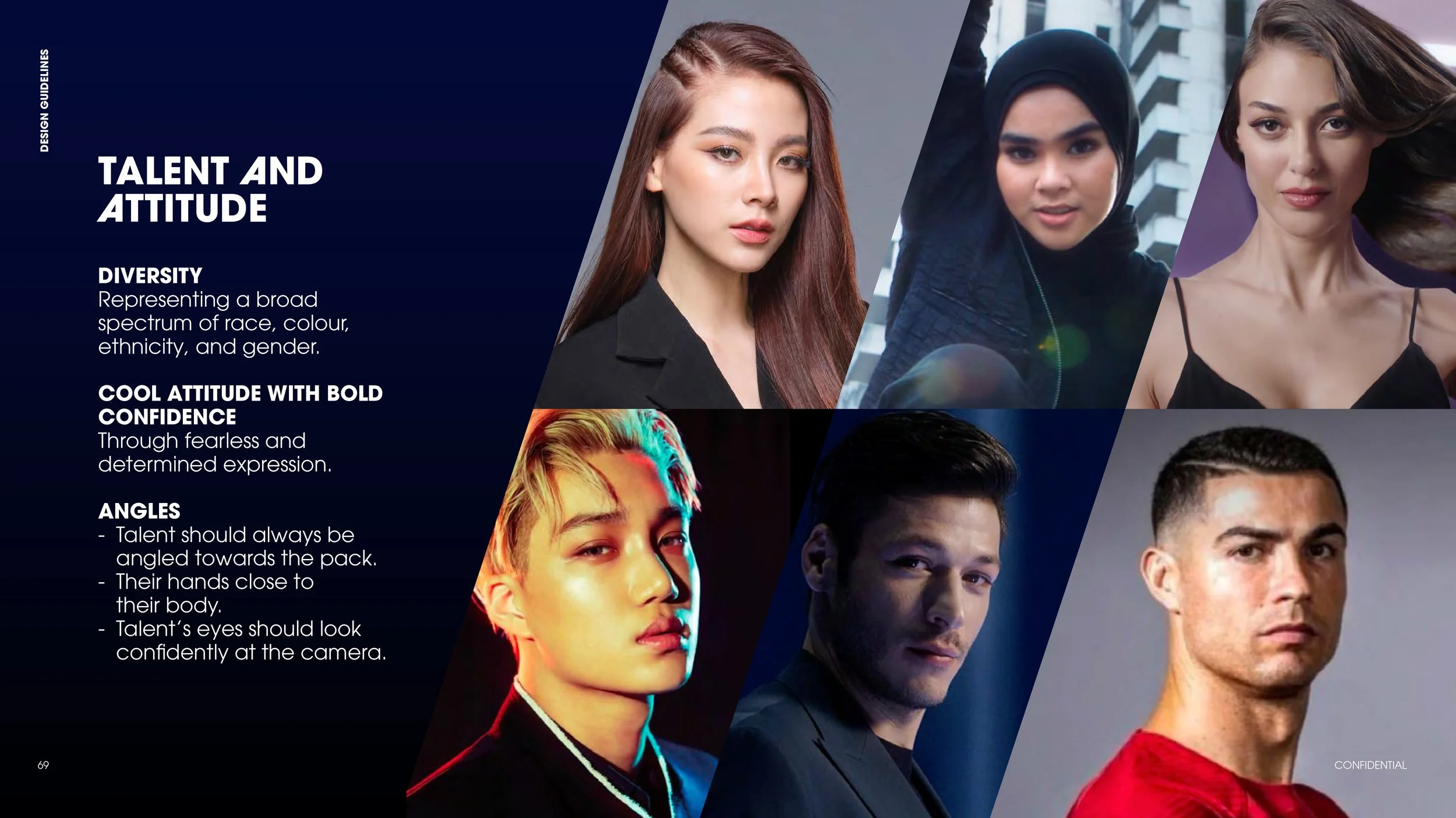
TALENT GUIDE


FINAL DESIGN PRINCIPLES


CLEAR BRAND BOOK VIDEO
We were tasked with bringing the brand book principles in a more digestible format.