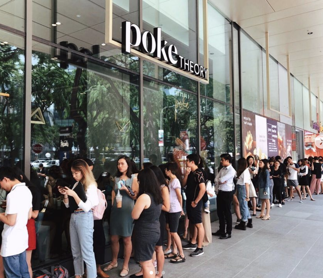
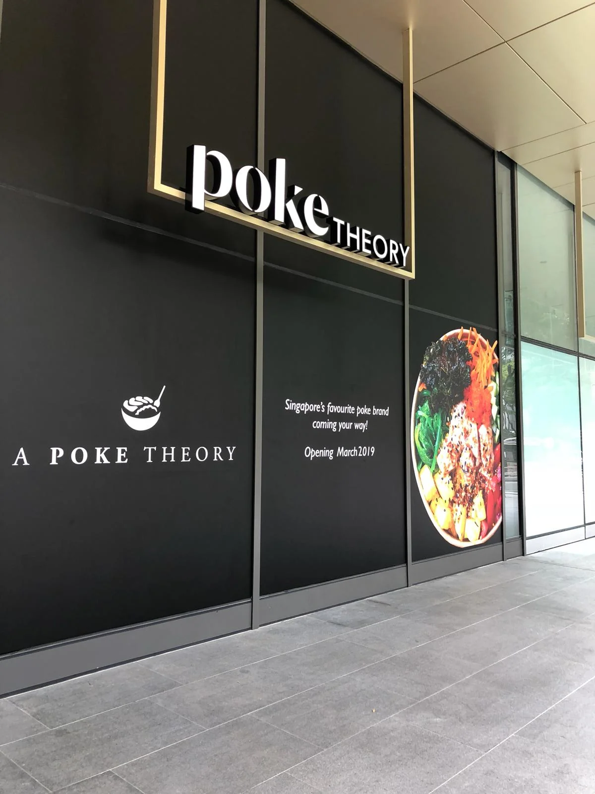
Client: Poke Theory
Job Scope: Brand Identity
Poke Theory (pronounced poh-kay) is a non-traditional haven for the adventurous foodie. Introducing a rainbow palette to Singapore’s market, Poke Theory celebrates the diversity of nutrients in our food pyramid with a colourful feast. Although undeniably heathy, Poke Theory aims to position their nutrient-packed bowls outside of the health-conscious market for everyone to enjoy.
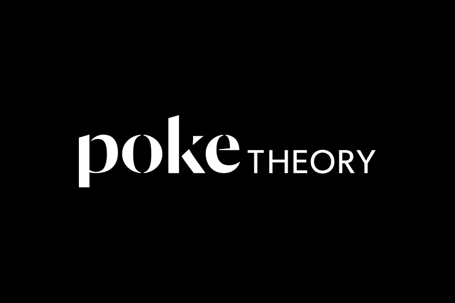
Design 1 (Selected by Client)
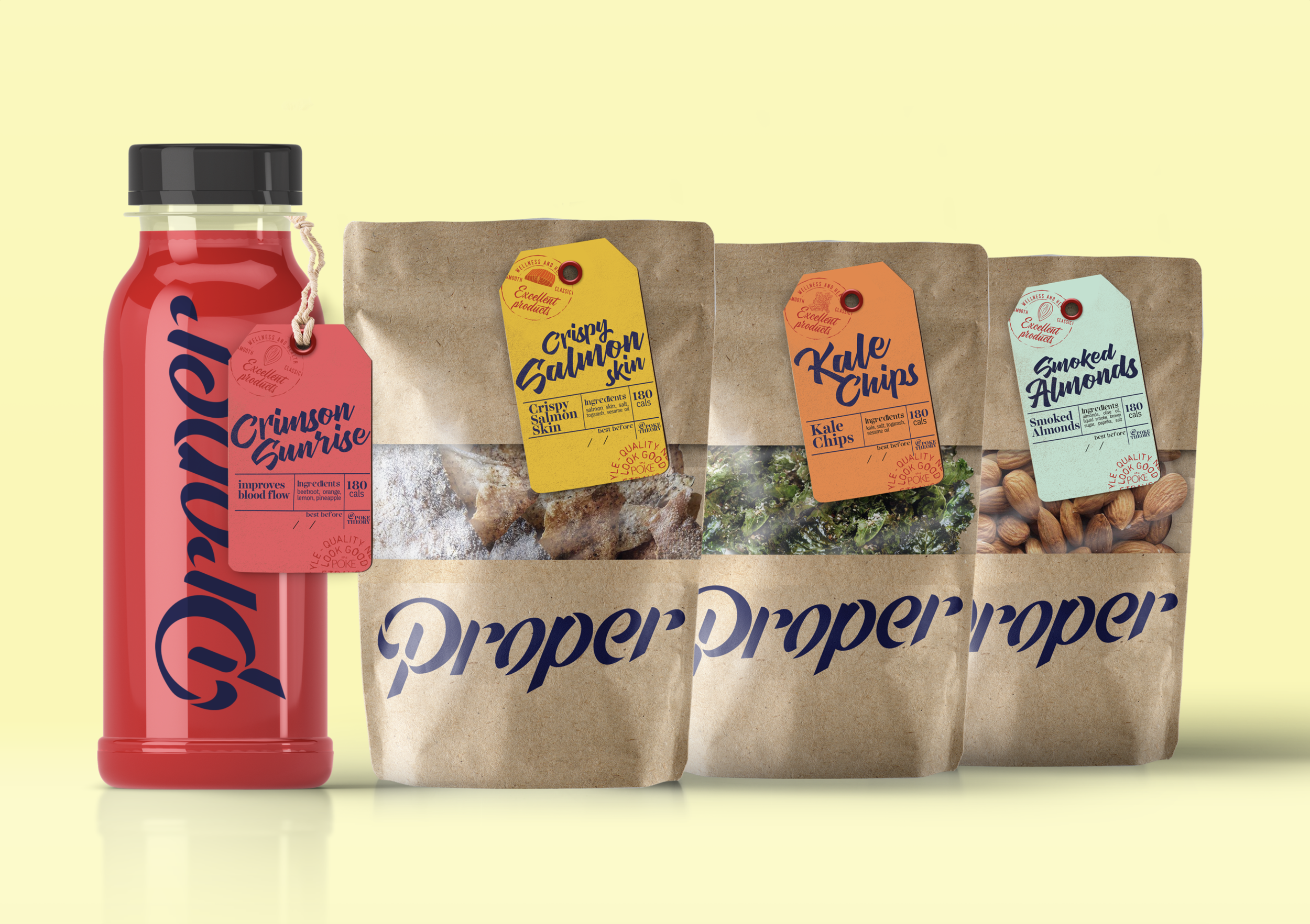
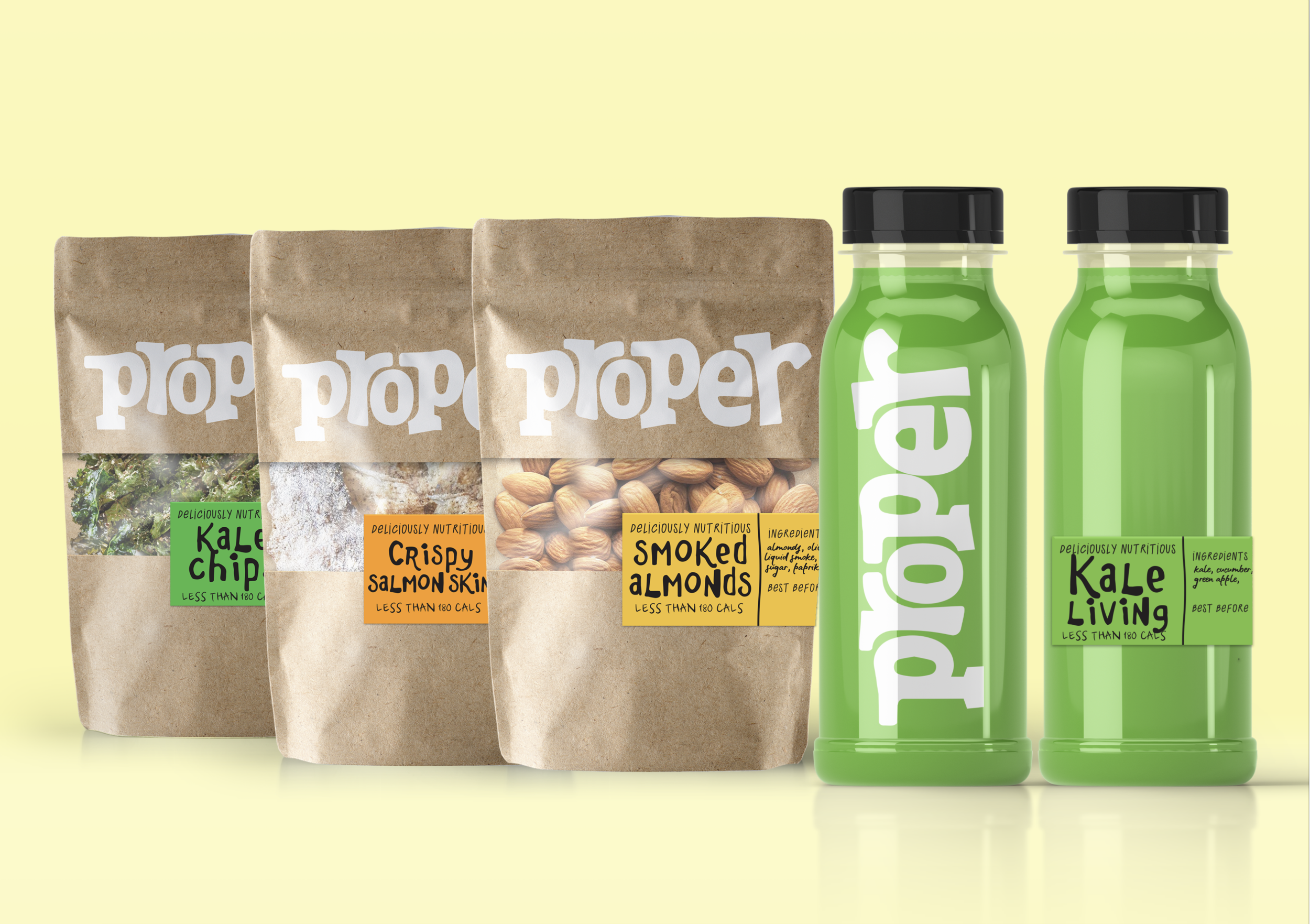
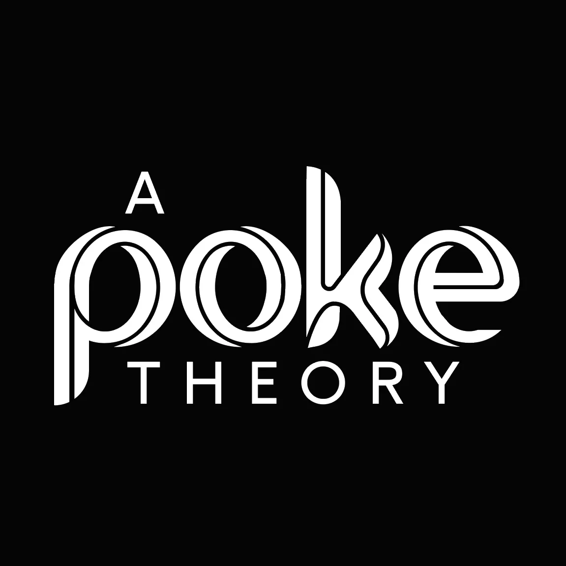
Poke Theory maintains an air of classiness with a jet-black branding, accented by pops of colour every now and then, effectively letting their ingredients’ natural colours shine when the logo is applied to other brand collaterals. The delicate approach with stencil-like typography gives the brand a contemporary image.
Stencil Logo Explorations
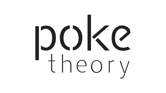
This stencil-like typography boasts thinner, more minimalist strokes.
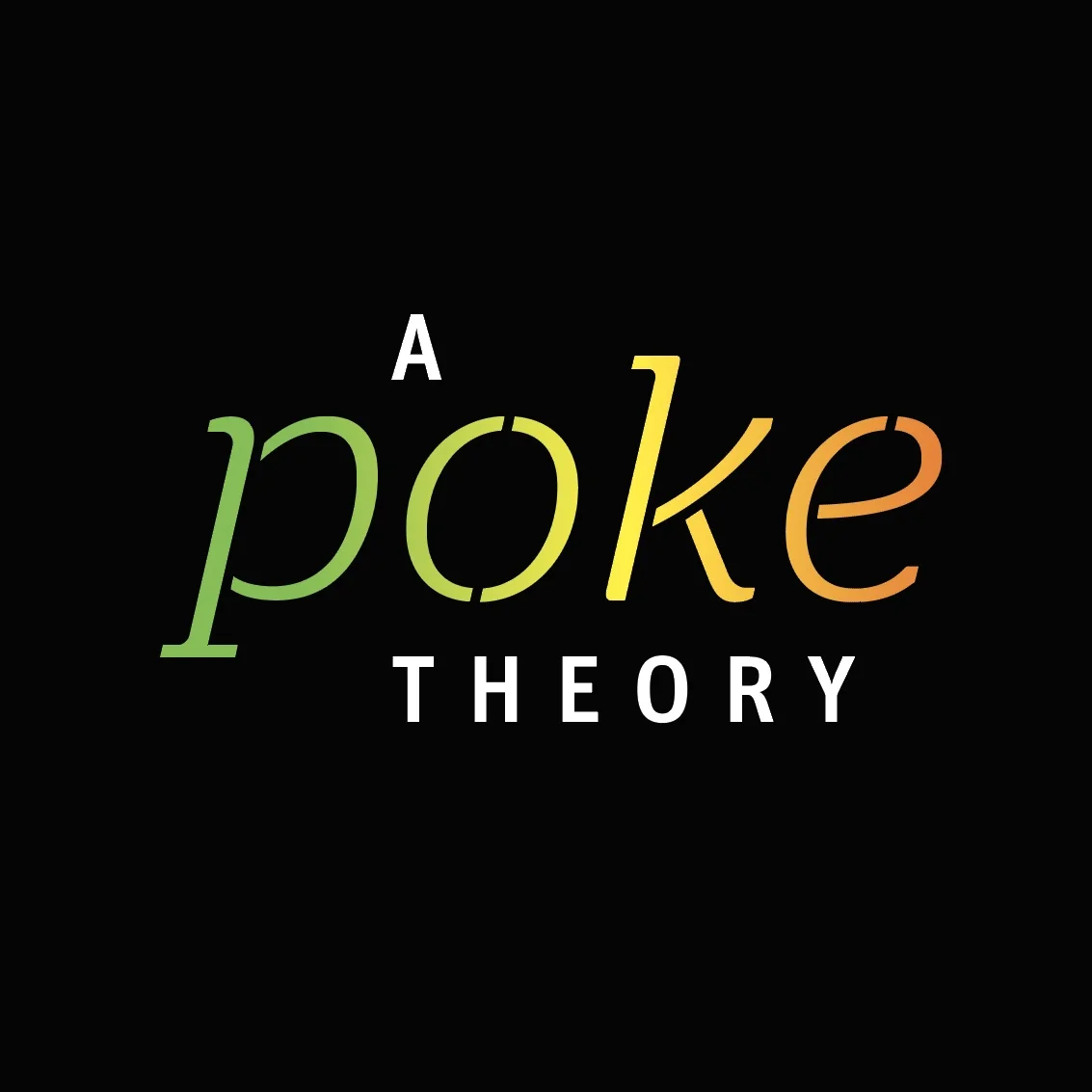
This stencil rainbow logo reflects the colourful and deliciously nutritious poke bowls.
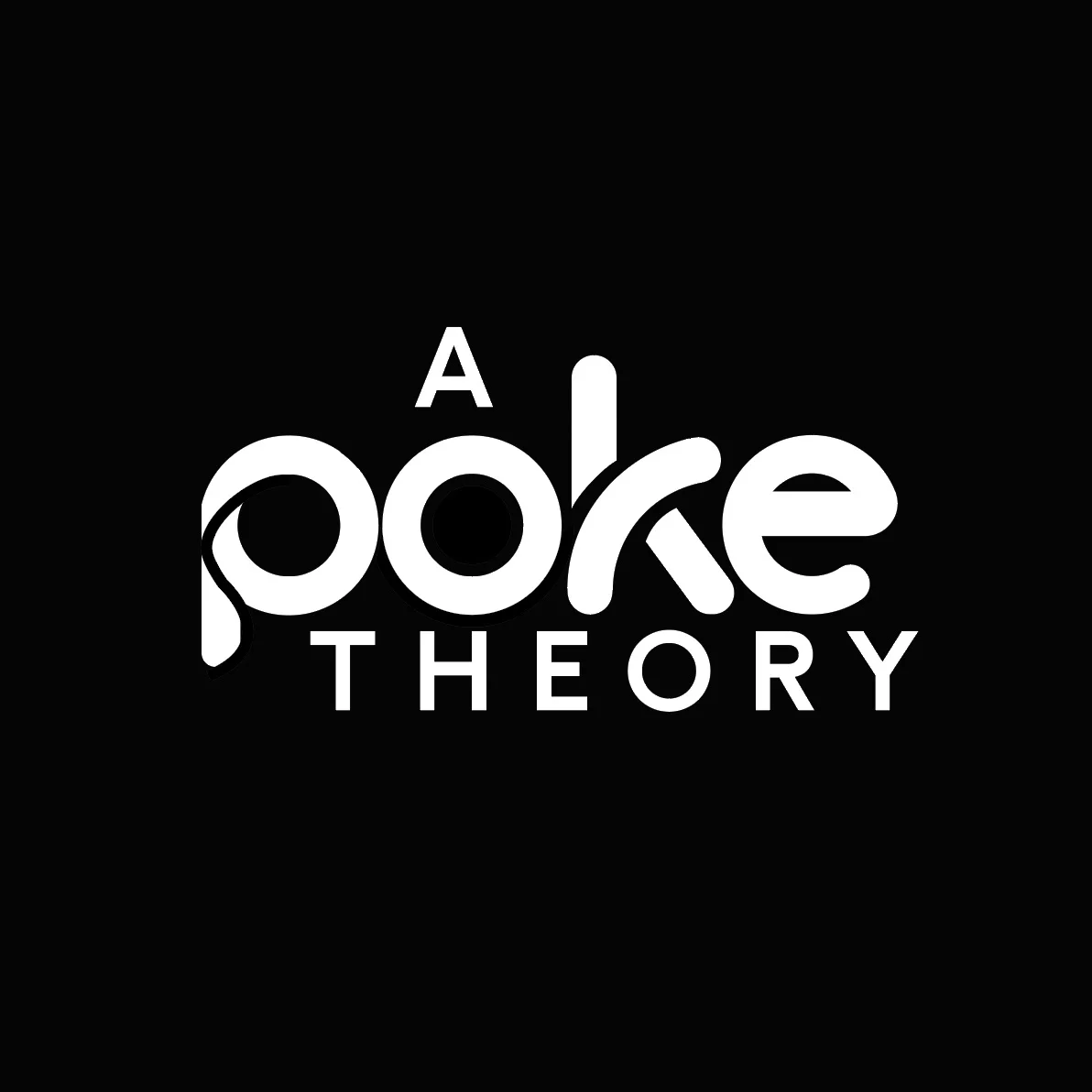
This is a dynamic take on Stencil Typography, a nod to Poke Theory’s well-rounded and healthy menu.
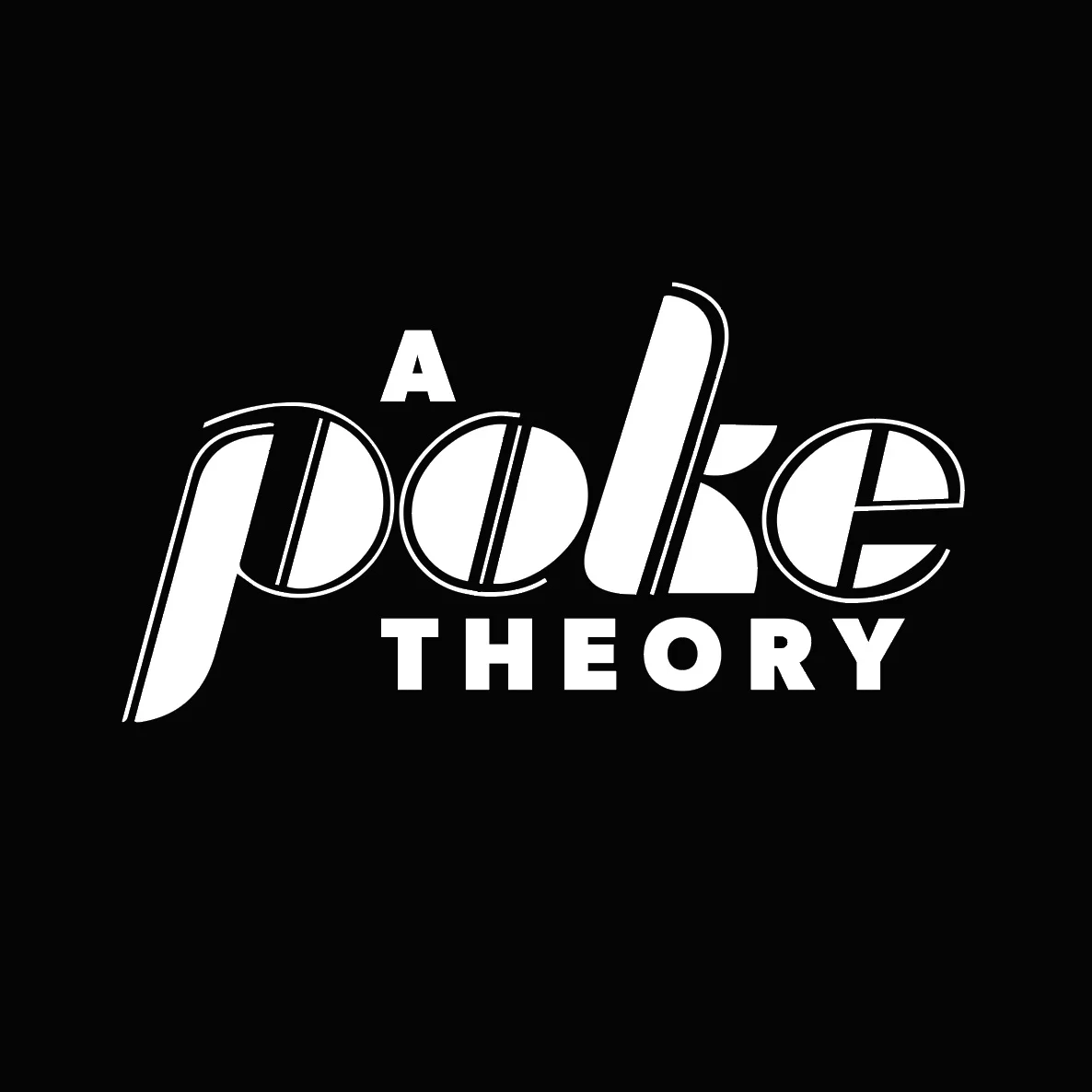
This logo explores an approachable typography with dynamic cuts.
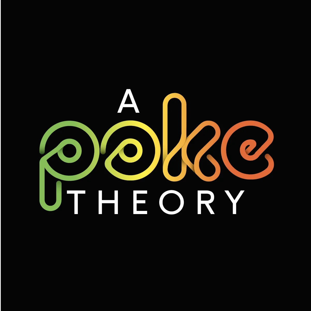
This rounded rainbow logo reflects the colourful and deliciously nutritious poke bowls.
This logo nods to the wide variety of nutritious ingredients and the lines reflect the playful. integrated and palatable taste the bowls achieve.

Here are the Stencil Typography Logos that I proposed.